Building a scalable design system for a multi-method research platform
How I created a reusable design foundation for a research platform expanding beyond surveys - using AI extensively to accelerate comparative research, UI audits, system planning, documentation, and design QA.
- ROLE
- Product Designer
- Timeline
- Mid-2025
- Project
- Product design system
- Scope
- Design-system strategy, UI audit, foundations and tokens, component architecture, states, documentation, engineering handoff, and adoption
- PLATFORM
- Multi-method B2B research platform connecting researchers with vetted participants for paid studies
- Tools
- Figma, Figma Variables, Components, AI-assisted research and documentation
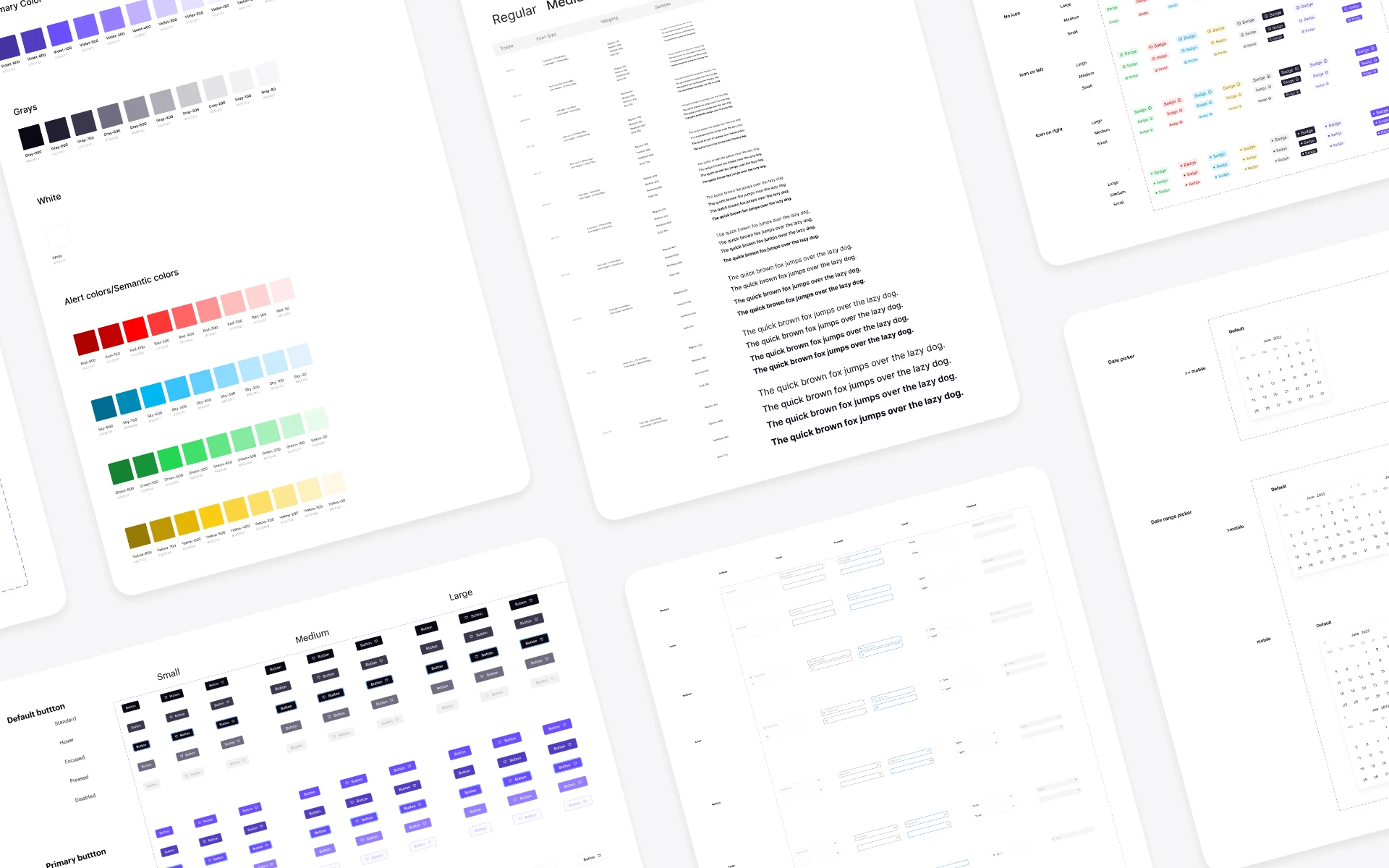
The context
The platform initially focused on online surveys. Researchers could create studies, recruit participants, collect responses, and manage incentives. Participants could discover relevant surveys, complete them, and receive rewards.
As the product expanded, it began supporting additional research methods, including:
- Unmoderated testing
- Moderated user testing
- Research interviews
- Study scheduling and session management
- Participant management
- More advanced study configuration
- Search, filtering, and data-heavy workflows
The expansion changed the product from a survey-focused platform into a broader research platform. That shift introduced new interaction models, more complex forms, scheduling flows, richer participant data, new feedback patterns, and a larger set of UI states.
The existing interface had evolved through individual feature work. It contained useful patterns, but those patterns were not organized into a scalable or documented system.
From
Survey-focused workflows
To
Multiple research methods, scheduling, moderated sessions, and participant management
Design challenge
Create consistency across expanding workflows without making the system too rigid or difficult to maintain.
AI contribution
Accelerated comparative research, UI-audit synthesis, taxonomy exploration, documentation, and state-gap review.
The problem
As the platform grew, similar interface patterns were being designed and implemented differently across the product.
Examples included:
- Buttons with similar purposes but inconsistent hierarchy, size, or styling
- Form fields with different spacing, validation behavior, and states
- Tags, badges, filters, and statuses used interchangeably
- Missing loading, error, empty, selected, and disabled states
- Screens designed from previous examples rather than shared principles
- Engineering handoff that required screen-by-screen interpretation
- New research methods at risk of creating separate visual languages
This was more than a visual-consistency issue.
For users, the product became harder to learn because similar interactions did not always behave or look the same. For designers, routine decisions were repeatedly revisited. For engineers, component behavior and edge cases were often unclear until implementation.
The challenge was not to create a library of polished UI elements. It was to create a shared product language that could support multiple research methods without fragmenting the experience.
My goal
I set out to create a practical, documented design system that would:
- Support the platform’s expansion beyond surveys.
- Create more consistent experiences across study creation, scheduling, participant management, and reporting workflows.
- Make common design decisions faster and easier to repeat.
- Give design and engineering a shared vocabulary for patterns, states, and behavior.
- Establish a scalable foundation without overengineering the system.
I intentionally did not try to recreate a large enterprise design system. Instead, I focused on a useful core: the foundations and component families that would create the greatest value across current and upcoming product work.
My role
I was responsible for:
- Auditing the existing product UI
- Identifying repeated patterns, inconsistencies, and missing states
- Researching and comparing established design systems
- Defining the system’s structure and component taxonomy
- Creating visual foundations, color scales, semantic colors, and usage guidance
- Designing component families, variants, and interaction states
- Creating documentation and usage guidance
- Applying the system to real product workflows
- Preparing handoff guidance for engineering
- Using AI as a substantial support tool for analysis, synthesis, documentation, and design-system QA
1. Establishing a research foundation
Before designing components, I wanted to understand how mature design systems solve similar problems: organizing tokens, structuring components, documenting behavior, defining states, and balancing flexibility with consistency.
I selected established systems that represented different product contexts and levels of maturity:
- Material Design
- IBM Carbon Design System
- Shopify Polaris
- Adobe Spectrum
- Atlassian Design System
- Apple Human Interface Guidelines
- Ant Design
- Uber Base Web
The goal was not to copy any one system. It was to identify proven patterns and determine which approaches were appropriate for this platform.
Using AI for comparative design-system research
AI played a meaningful role in this phase.
I supplied AI with the reference design systems I had selected and directed it to analyze them using specific criteria. Rather than manually creating a first-pass comparison across every system, I used AI to synthesize the references and surface patterns across:
- Foundation and token architecture
- Component taxonomy
- Naming conventions
- Variant and state models
- Documentation formats
- Accessibility guidance
- Content guidance
- Design-to-development handoff patterns
- Approaches to flexibility versus standardization
This allowed me to move faster from a large set of reference materials to a structured set of observations and questions.
For example, AI helped identify recurring questions such as:
- How do mature systems distinguish filters, tags, badges, dropdowns, and selection controls?
- Which interaction states are consistently treated as essential?
- How are semantic tokens named and grouped?
- What documentation structure is useful for both designers and engineers?
- When do systems introduce a new component versus extending an existing one with a variant?
I used this analysis as a research accelerator - not as a substitute for professional judgment.
I validated important findings against the original reference systems, then evaluated them against the product’s actual workflows, the team’s language, user needs, and engineering constraints.
| Stage | My contribution | AI contribution | Final output |
|---|---|---|---|
| Select reference systems | Chose relevant, mature systems to study | - | Curated research set |
| Define evaluation criteria | Identified what needed comparison: tokens, taxonomy, states, documentation, accessibility | Structured analysis around those criteria | Comparative research framework |
| Supply reference material | Provided the selected system references | Synthesized recurring patterns and differences | First-pass comparison |
| Review findings | Validated recommendations against source material and product needs | Surfaced questions, patterns, and alternatives | Product-relevant observations |
| Make decisions | Defined the final system direction | Supported exploration and documentation | Design-system strategy |
AI significantly reduced the time needed to synthesize design-system research. It helped me process a wider set of references, compare approaches more systematically, and focus my time on product-specific decisions.
2. Auditing the existing product interface
With a research framework in place, I audited the current product interface.
I reviewed UI patterns across:
- Buttons and links
- Inputs, text areas, selects, and dropdowns
- Search and filtering
- Tags, badges, and status indicators
- Navigation and pagination
- Dialogs, overlays, and tooltips
- Notifications, banners, and feedback messages
- Tables and data-heavy interfaces
- Empty, loading, error, and success states
- Typography, colors, spacing, and icons
The purpose was not just to catalogue the product. I needed to understand which patterns were already reusable, which were inconsistent, and which new components were required as the product introduced more research methods.
Using AI to accelerate the UI audit
AI made the audit significantly more efficient.
After creating an initial inventory of the product’s UI patterns, I used AI to help organize, group, and interrogate the findings. It supported the early analysis by helping me:
- Cluster visually or behaviorally similar patterns
- Identify potential naming overlaps
- Surface duplicate or near-duplicate components
- Generate first-pass component categories
- Flag areas where states appeared incomplete
- Produce structured audit templates
- Create prompts for accessibility and edge-case review
- Explore alternative ways to organize the component library
For example, I could provide a list of existing patterns - such as buttons, search fields, filters, tags, badges, dropdowns, and select controls - and ask AI to identify likely overlaps, distinctions, and questions for further review.
This saved time during the divergent phase of the work: organizing a large amount of UI information, exploring alternatives, and identifying gaps.
I then manually reviewed and refined the output based on:
- User intent
- Interaction behavior
- Visual similarity
- Product-specific requirements
- Engineering feasibility
- Existing team terminology
- Whether the pattern had enough repeated use to become reusable
| Category | Definition | Example |
|---|---|---|
| Existing reusable patterns | Patterns already used across the product that could be formalized and refined | Buttons, form controls, notifications |
| Patterns needing consolidation | Similar patterns with inconsistent size, styling, naming, or behavior | Filters, tags, status indicators |
| New patterns required by expansion | Components needed because new research methods introduced new workflows | Scheduling, calendar interactions, moderated-session flows |
3. Defining the system architecture
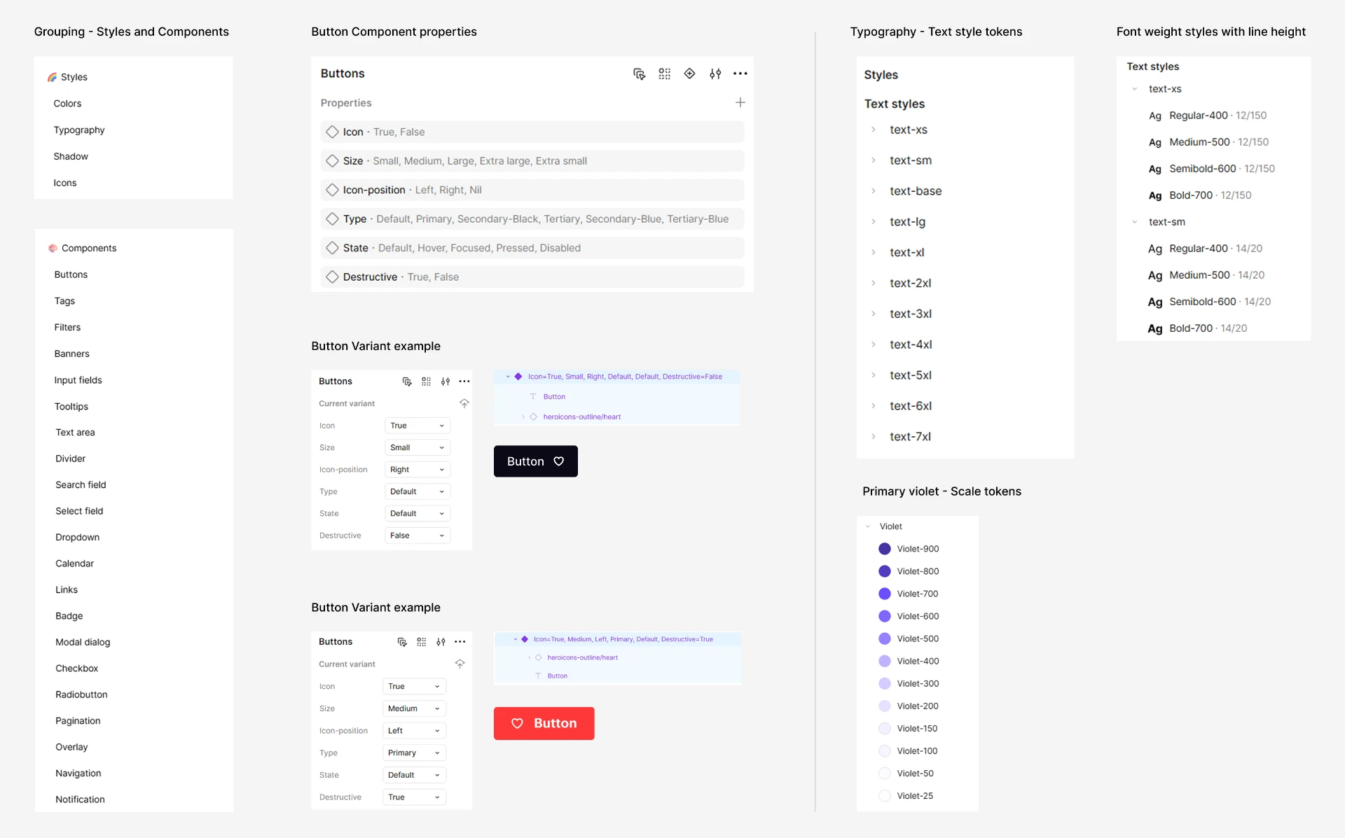
I organized the design system into two clear layers: foundations and components.
Foundations
Foundations established the reusable decisions behind every interface:
- Color scales, semantic colors, and usage guidance
- Typography hierarchy
- Spacing and sizing rules
- Border-radius rules
- Shadows and elevation
- Icon usage
- Interactive-state values
Components
Components translated those foundations into reusable product patterns:
- Buttons and links
- Inputs and text areas
- Search, filters, selects, and dropdowns
- Checkboxes and radio buttons
- Tags and badges
- Banners and notifications
- Tooltips, overlays, and dialogs
- Calendars and date controls
- Navigation and pagination
This structure helped distinguish between the underlying rules of the interface and the assembled patterns used in product screens.
4. Creating scalable foundations
Color system and scalable color tokens
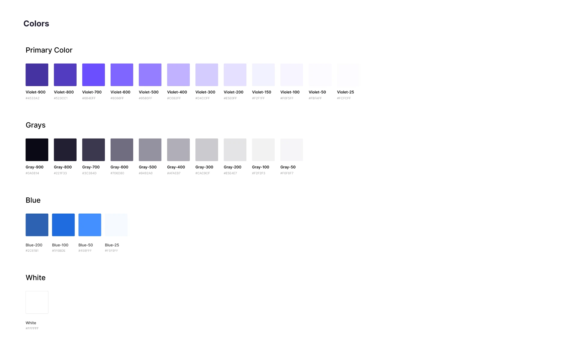
The product already used a clear and straightforward color-naming approach. I formalized that approach into a scalable color system that could be consistently applied across the interface.
The system included:
- Violet as the primary brand and action color
- Grays and white as neutral colors for text, backgrounds, borders, dividers, badges, and other interface elements
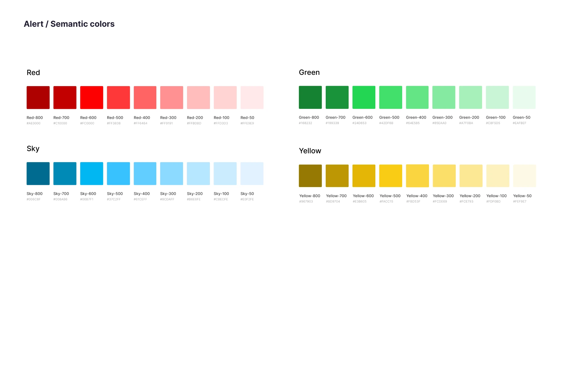
- Semantic color scales for communicating feedback and status:
- Green for positive and success-related states
- Red for destructive actions, errors, and critical events
- Yellow for warnings and actions requiring attention
- Sky for important informational messages
Rather than introducing overly abstract token names, I used a simple scale-based naming convention across every color family. Each color was named by its family and intensity - for example, Violet-900, Violet-700, Gray-500, Green-600, and Red-500. This made the system easy to scan, discuss, and apply consistently in both design and handoff.
| Color family | Example tokens | Primary use |
|---|---|---|
| Violet | Violet-900 to Violet-25 | Brand identity, primary actions, and important highlights |
| Gray | Gray-900 to Gray-50 | Text, backgrounds, borders, dividers, badges, and supporting interface elements |
| White | White | Light surfaces and inverted contexts |
| Green | Green-800 to Green-50 | Positive feedback and success states |
| Red | Red-800 to Red-50 | Errors, destructive actions, and critical events |
| Yellow | Yellow-800 to Yellow-50 | Warnings and states requiring user attention |
| Sky | Sky-800 to Sky-50 | Informational messages and important information |
The primary violet scale supported both high-emphasis actions and lighter interface treatments. For example, darker values such as Violet-900 and Violet-800 could support stronger emphasis, while lighter values such as Violet-200, Violet-100, and Violet-50 could be used for subtle backgrounds, selected states, or low-emphasis surfaces.
Neutral colors were used throughout the product to establish hierarchy and structure. Gray-900 was used as the primary text color, while lighter gray values supported secondary text, borders, background layers, and dividers. White was retained as a core surface color.
Semantic colors followed the same naming structure as the primary and neutral scales. This created a consistent and predictable system while allowing feedback colors to be used appropriately across banners, notifications, validation, status indicators, and other product states.
Text and border colors were selected according to their background context to maintain readable contrast. Text could invert on dark backgrounds when necessary, and borders were chosen to clearly separate elements without creating unnecessary visual weight.
Typography, spacing, elevation, and icons
I defined consistent rules for:
- Page titles, headings, labels, body text, captions, and supporting text
- Form-field spacing and label relationships
- Button padding and component dimensions
- Card, section, and layout gaps
- Elevation for dialogs, dropdowns, overlays, and tooltips
- Icon sizing, alignment, and semantic use
The goal was to reduce arbitrary decisions while preserving flexibility for complex research workflows.
Consistency should reduce unnecessary decisions, not remove the flexibility required by real product workflows.
5. Designing components around purpose and behavior
I designed components around the job they performed, not only their visual style.
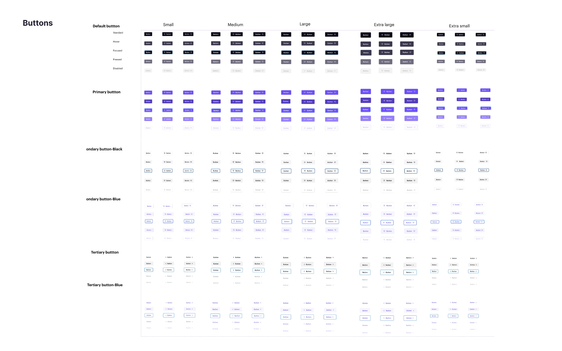
Buttons
Buttons appeared throughout the platform: creating studies, saving configurations, managing participants, scheduling sessions, and confirming actions.
I created a flexible button family that supported:
- Primary, secondary, tertiary, and destructive hierarchy
- Multiple sizes
- Text-only, icon-leading, and icon-trailing formats
- Hover, focus, pressed, disabled, and loading states
A key decision was to use variants and properties when the interaction model remained the same, rather than creating a new component for every minor visual difference.
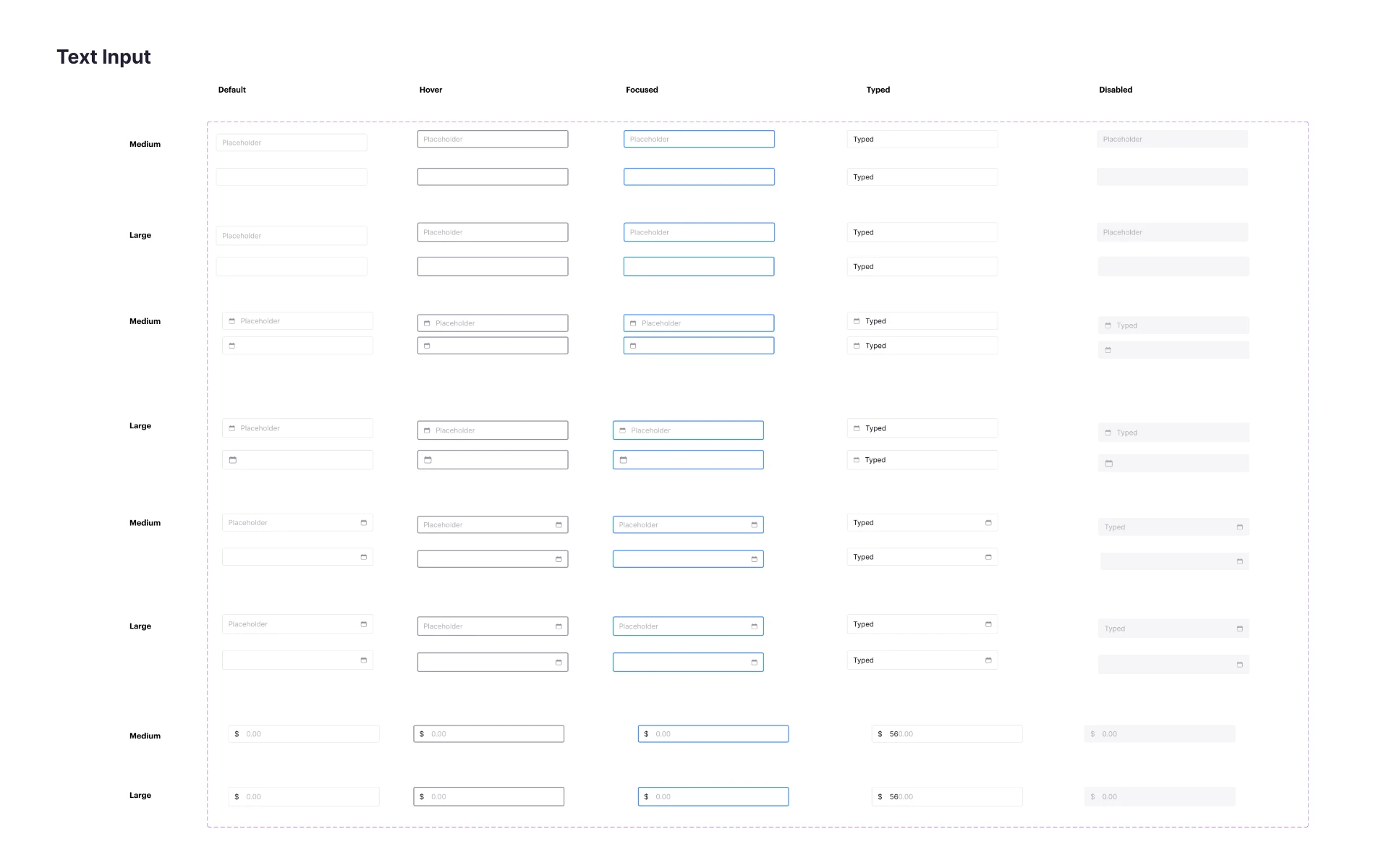
Form controls
The platform relied heavily on complex forms for study creation, participant screening, session setup, and research configuration.
I created reusable patterns for:
- Input fields
- Text areas
- Search fields
- Select fields
- Dropdowns
- Checkboxes
- Radio buttons
- Calendar controls
Each component accounted for relevant states and content conditions, including labels, helper text, placeholders, required indicators, validation, error messages, disabled behavior, read-only behavior, focus, long content, and selected values.
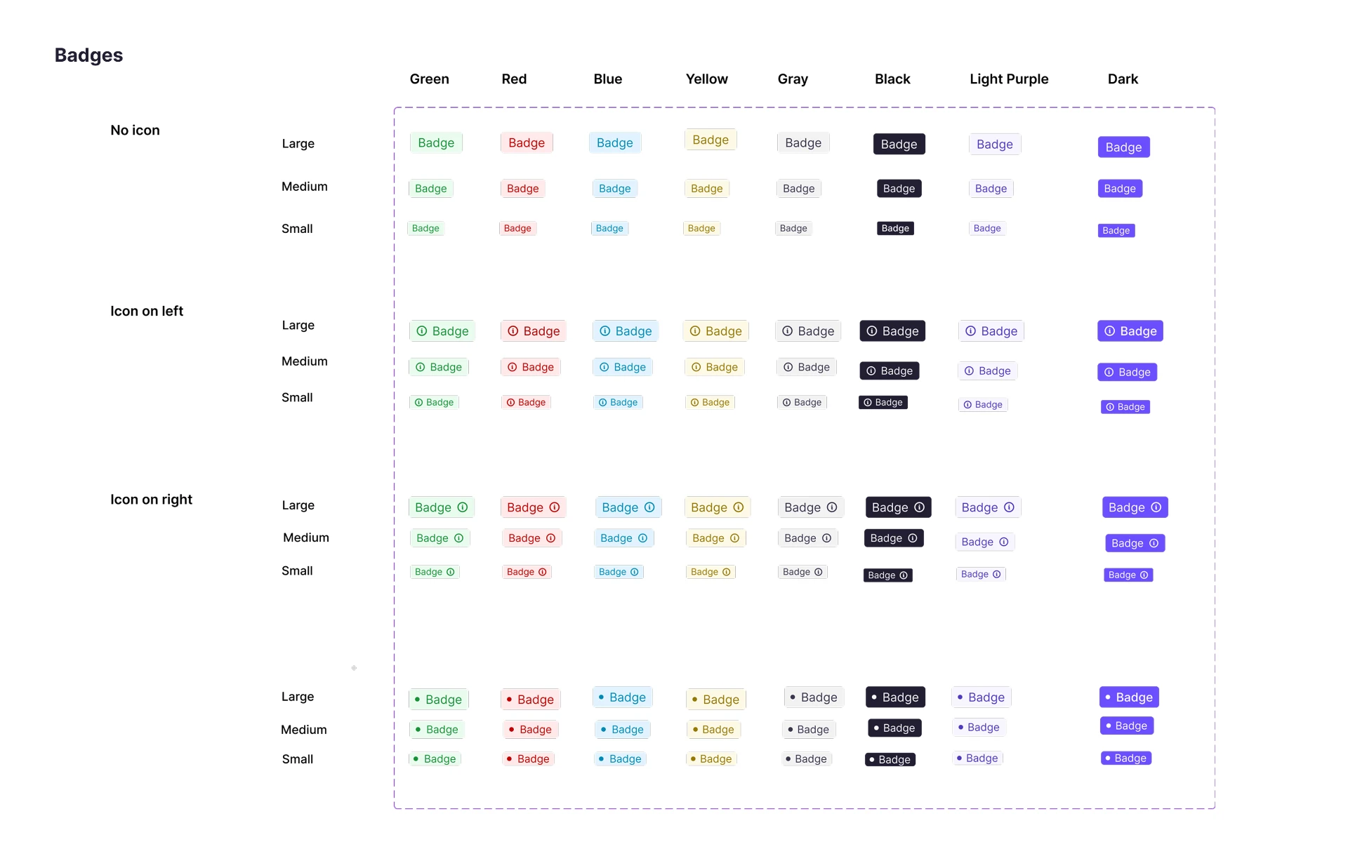
Search, filters, tags, and badges
These patterns were especially important for study, participant, and session-management workflows.
I clarified their different purposes:
| Pattern | Primary purpose |
|---|---|
| Search | Helps users find content |
| Filter | Narrows a result set |
| Tag | Represents a selected or removable value |
| Badge | Communicates compact status or classification |
This distinction reduced the tendency to use similar-looking components interchangeably.
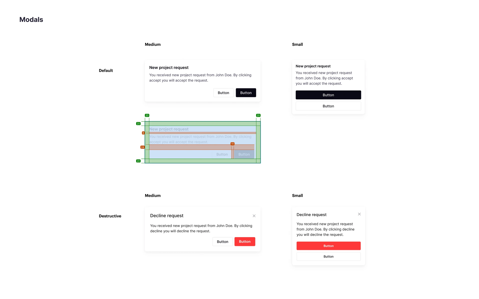
Dialogs, notifications, and feedback
I also created reusable patterns for:
- Success, warning, error, and informational messages
- Persistent banners and temporary notifications
- Confirmation dialogs
- Destructive actions
- Modal structures and overlay behavior
These patterns included guidance on hierarchy, action placement, dismissal behavior, severity, and long-content handling.
6. Designing beyond the default state
A core focus of the system was ensuring components worked in realistic product conditions - not just in polished default states.
Depending on the component, I defined and documented states such as:
- Default
- Hover
- Focus
- Pressed
- Selected
- Disabled
- Loading
- Error
- Success
- Empty
- Read-only
| Component | Key states considered |
|---|---|
| Button | Default, hover, focus, pressed, disabled, loading |
| Input field | Default, filled, focused, error, success, disabled, read-only |
| Checkbox | Checked, unchecked, indeterminate, focused, disabled |
| Dropdown | Closed, open, selected, empty, error |
| Calendar | Current date, selected date, unavailable date, loading, navigation |
| Notification | Severity, persistent/dismissible behavior, action state |
AI-assisted state and edge-case review
Once I had created a component, I used AI as a structured review tool to generate questions around potential gaps and edge cases.
For example:
- Does the component have a clear focus state?
- What happens with unusually long content?
- Does the user understand the difference between disabled and unavailable?
- Is the error behavior clear and consistent?
- What happens when a search returns no results?
- Does loading behavior prevent duplicate actions or unclear feedback?
- Are there states that will matter during keyboard interaction?
AI did not decide which states belonged in the system. It helped make the review process more thorough and less dependent on memory alone. I evaluated the suggestions against the product’s real behavior and incorporated only what was relevant.
7. Accessibility considerations
Accessibility was included in the design-system work rather than treated as a final-stage review.
I considered:
- Color contrast
- Visible focus states
- Text hierarchy and legibility
- Touch and click target size
- Labels and supporting text
- Error-message placement
- Keyboard-related states
- Disabled versus unavailable behavior
- Communicating meaning through more than color alone
AI was useful for generating accessibility review prompts and identifying potential omissions, such as unclear labels or missing focus behavior. However, AI output was never treated as accessibility certification or final validation.
Final component decisions were reviewed against accessibility guidance and discussed with engineering where implementation behavior mattered.
8. Documentation and engineering handoff
A component library becomes useful only when people understand how, when, and why to use it.
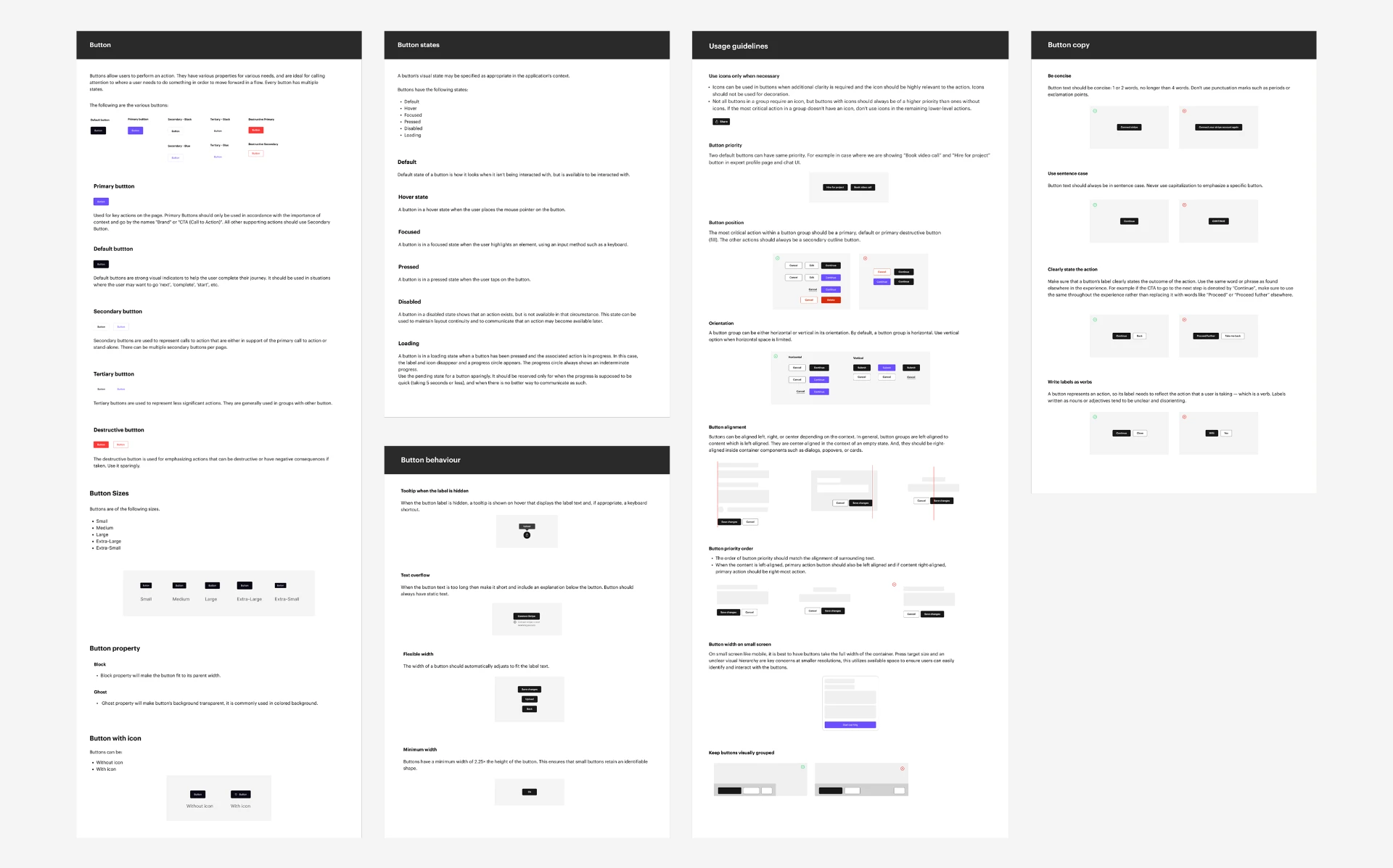
For each component, I documented:
- Purpose
- When to use it
- When not to use it
- Available variants and sizes
- Supported states
- Interaction behavior
- Content guidance
- Accessibility considerations
- Do’s and don’ts
- Related components
- Handoff notes
- Color-scale naming and intended usage for primary, neutral, and semantic colors
AI as a documentation and knowledge-scaling tool
Documentation was one of the areas where AI delivered the most practical value.
After I defined a component’s real purpose, properties, behavior, and limitations, I used AI to create structured first drafts for:
- Component descriptions
- Usage guidance
- Do’s and don’ts
- State explanations
- Content recommendations
- Accessibility reminders
- Handoff tables
- Documentation outlines
This reduced repetitive writing and formatting work across a growing library. It allowed me to spend more time on the higher-value work: reviewing accuracy, resolving contradictions, refining product-specific guidance, and aligning documentation with implementation realities.
Every output was edited and validated before use. I ensured the documentation reflected:
- The component’s actual behavior
- The team’s product vocabulary
- Design and engineering needs
- Real workflow constraints
- Clear, non-generic guidance
| Area | How AI helped significantly | My responsibility |
|---|---|---|
| Comparative research | Synthesized the reference design systems I supplied and surfaced patterns across tokens, taxonomy, states, documentation, and accessibility | Selected the references, verified analysis, and chose what fit the product |
| UI audit | Organized inventories, suggested groupings, surfaced naming overlaps and possible duplicate patterns | Validated real component boundaries and audit decisions |
| Taxonomy | Explored alternative component categories and naming structures | Defined the final system architecture and vocabulary |
| State review | Generated structured questions about missing states, edge cases, and accessibility considerations | Decided which states were needed and how they should behave |
| Documentation | Created first drafts of guidance, state descriptions, do’s/don’ts, and handoff structures | Edited, validated, and finalized product-specific documentation |
| Handoff preparation | Helped structure component properties and state matrices | Aligned details with engineering constraints and product behavior |
AI was not a minor add-on to the process. It was a practical force multiplier: it helped me research more broadly, audit more systematically, document more consistently, and review component gaps more thoroughly - while I retained ownership of design quality and product decisions.
9. Applying the system to real workflows
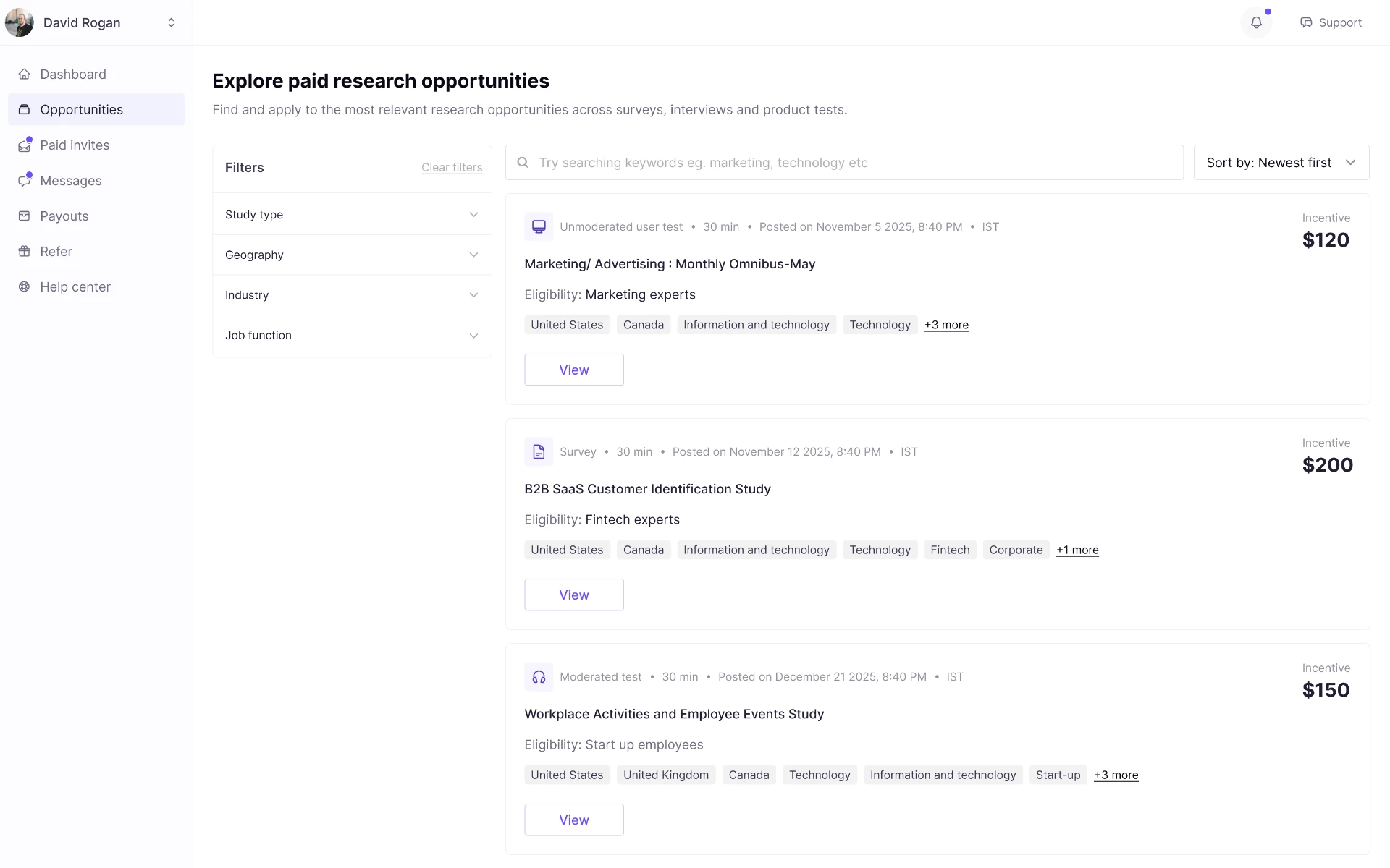
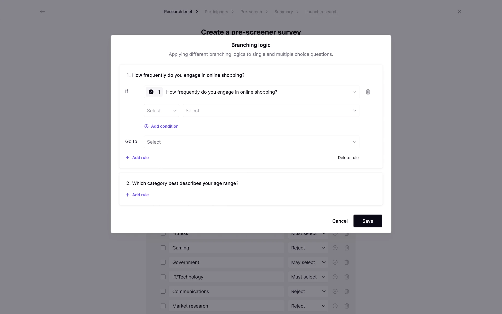
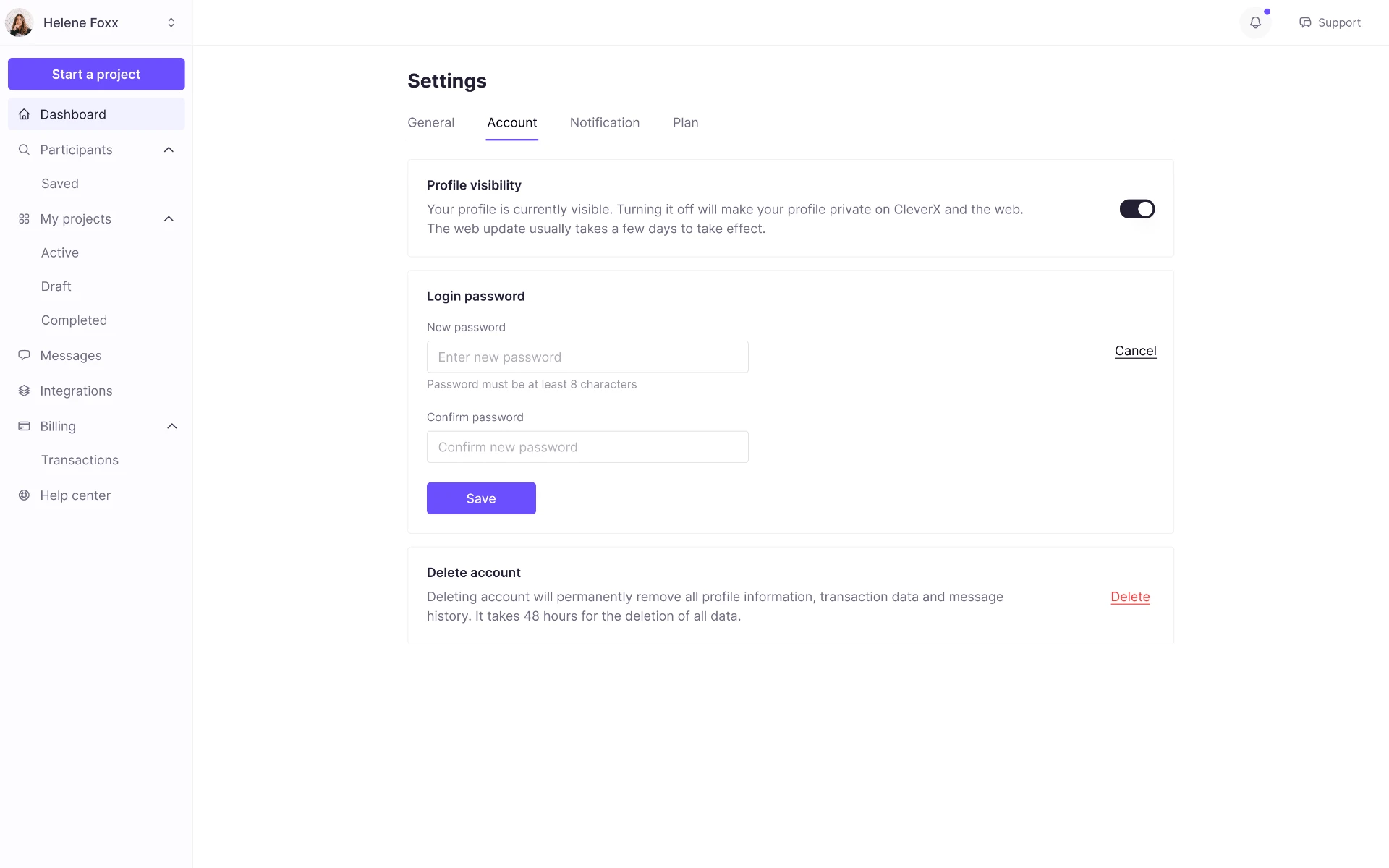
The design system was applied to product work supporting the platform’s expansion.
This included:
- Various research study creation workflows
- Forms and configuration
- Search and filtering
- Participant management
- Scheduling and calendar interactions
- Notifications and confirmation flows
- Navigation and status displays
Applying components in real flows revealed gaps that were not visible in isolation.
For example, product use exposed needs for:
- Better long-content behavior
- More complete error treatments
- Additional disabled or read-only states
- Clearer relationships between components
- Responsive considerations
- More specific feedback behavior
I treated these discoveries as feedback for the system. Components were refined based on real product use instead of forcing workflows to fit an incomplete library.
10. Engineering alignment and governance
A system is only valuable if it can be implemented, adopted, and maintained.
I worked with engineering to clarify:
- Component naming
- Variant structure
- Token mapping
- Interaction behavior
- Responsive needs
- Edge cases
- Implementation constraints
- Which patterns should remain shared versus product-specific
I also created contribution principles to guide future system growth.
Before adding a new component or variant, the team could ask:
- Is this pattern repeated enough to become reusable?
- Does it have a distinct purpose or behavior?
- Can an existing component support the requirement?
- Is the difference visual, behavioral, or both?
- What states and documentation would it require?
- Can it be implemented and maintained consistently?
This helped avoid an uncontrolled collection of one-off variants while leaving room for the system to evolve with the product.
Outcomes
The design system became a shared foundation for the platform’s expansion from a survey-focused product to a multi-method research platform.
Consistency
Shared foundations and component behavior created more predictable experiences across study setup, forms, filtering, participant management, feedback, and navigation.
Faster design decisions
Designers could start from documented patterns rather than repeatedly deciding hierarchy, spacing, error behavior, and states at the screen level.
Clearer handoff
Design and engineering gained a common language for components, variants, tokens, interaction states, and edge cases.
Product scalability
The system gave new research workflows a consistent base without forcing every workflow into identical layouts or patterns.
AI-enabled efficiency
AI reduced the manual overhead of synthesizing research, organizing the audit, exploring taxonomy, generating documentation drafts, and reviewing potential state gaps.
The value of the system was not that every screen looked identical. It was that recurring decisions became intentional, reusable, and easier to scale as the product grew.
Key learnings
A design system is more than a component library
A useful system includes:
- Foundations and tokens
- Components and variants
- Interaction states
- Naming and shared language
- Documentation
- Accessibility considerations
- Engineering alignment
- Contribution principles
- Continuous learning from real product work
Systems need to be validated in product flows
A component can look complete in a library and still fail when it meets long content, complex forms, edge cases, data-heavy screens, or responsive constraints.
Applying the system in real product work was essential to making it practical.
AI works best when it strengthens - not replaces - design judgment
AI was most useful when used for information-heavy and repetitive work:
- Comparative research synthesis
- UI inventory organization
- Taxonomy exploration
- Naming options
- Documentation drafts
- State-gap prompts
- Accessibility review questions
- Handoff structure
Its value came from speeding up analysis and making the process more systematic. The final quality of the system still depended on product understanding, design judgment, validation, accessibility awareness, and engineering collaboration.
I used AI as a significant design-systems copilot: it expanded the breadth of my research, accelerated the audit, made documentation more scalable, and strengthened my review process. I used my product and systems-design judgment to turn that acceleration into a coherent, usable design system.