From survey payments to a shared credit system
Designing a transparent billing experience for a research platform expanding beyond surveys
- Role
- Product Designer
- Year
- 2024
- SCOPE
- Two-sided research marketplace connecting researchers with vetted participants for paid studies
- PLATFORM
- Billing strategy, pricing-model translation, billing information architecture, plan comparison, credit selection, checkout and upgrade flows, billing management, invoice history, and edge-case design
Impact at a glance
- +12%
- Checkout completion
- −34%
- Billing disputes
The redesign helped the platform move from one-off survey payments to a scalable billing system for multiple research methods, while making pricing and upgrades easier for customers to understand.
The context
The platform originally supported online surveys, where pricing was tied to a single activity: successful survey responses.
Study cost = number of participants × price per response
This model was easy to understand because customers made one straightforward purchase for one type of research.
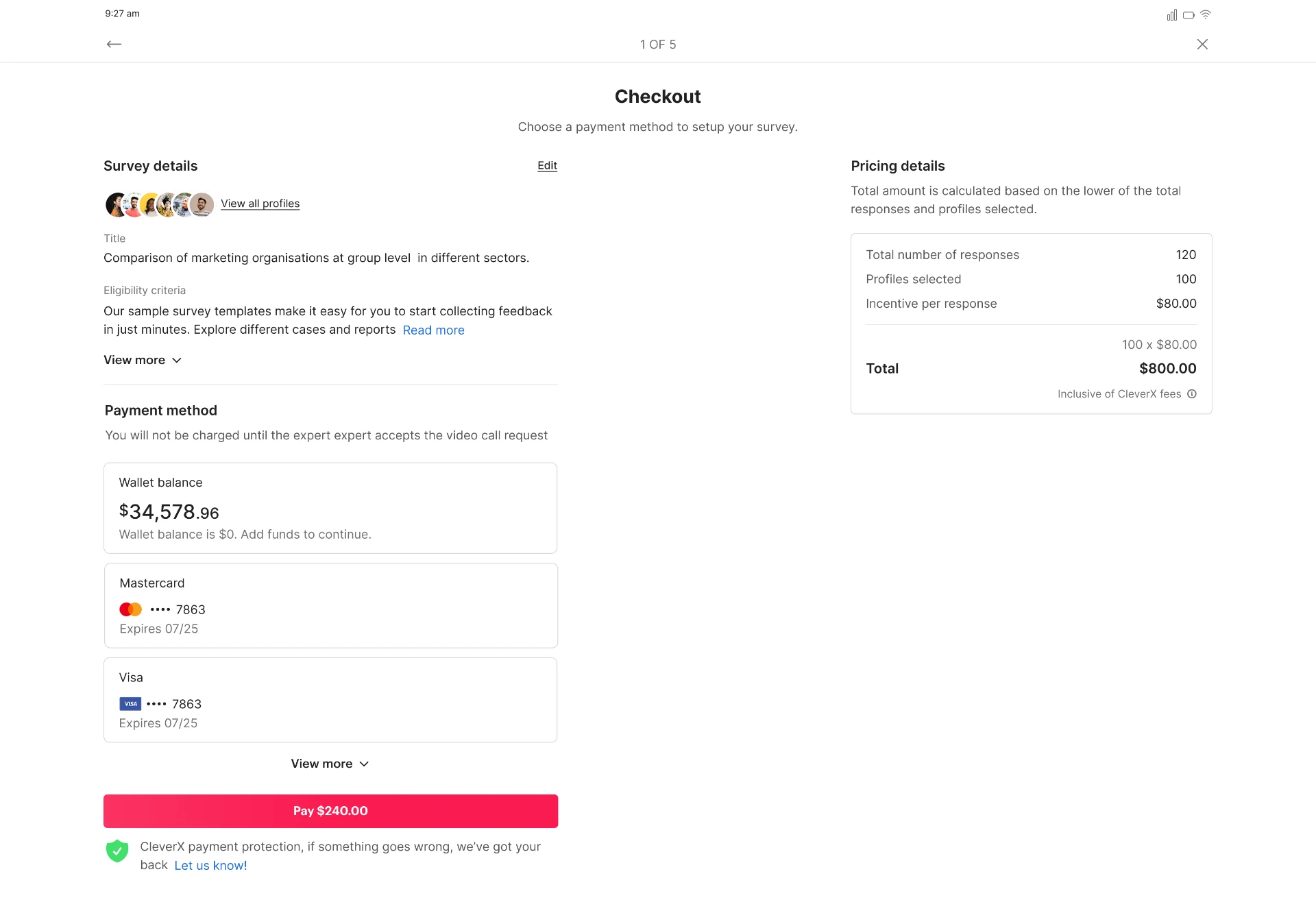
As the platform expanded into unmoderated user tests, moderated interviews, and moderated user tests, this transaction-based model no longer scaled. Different research methods required different levels of platform support, but customers still needed a predictable way to budget for research.
The business introduced a shared credit system that could support every research method. That changed the customer’s task from making a one-off survey payment to managing an ongoing research budget.
The problem
The existing checkout flow was designed for a survey-only product. It could calculate the cost of a single study, but it could not help customers understand or manage:
- A reusable credit balance
- Different credit requirements across research methods
- Flexible versus annual purchasing options
- Minimum credit commitments
- Existing credits during a plan upgrade
- The difference between an immediate charge and future renewal cost
- Billing history, payment methods, and invoices after purchase
Customers were now being asked to make a more consequential decision: not simply whether to pay for a study, but how much future research capacity to buy and what level of commitment to make.
Without clear explanations, customers had to interpret commercial rules while deciding how to spend their research budget.
How might we help research teams understand, purchase, and manage a shared-credit model without requiring them to do the billing maths themselves?
Understanding the new credit model
The new commercial model connected all research activities to a shared unit: credits.
| Research method | Credits per successful response |
|---|---|
| Online survey | 1 credit |
| Unmoderated user test | 1 credit |
| Moderated interview | 2 credits |
| Moderated user test | 2 credits |
Participant incentives were paid separately. This distinction mattered because credits represented platform usage, while participant compensation remained an additional research cost.
The design challenge was not simply displaying these rules. Customers needed to connect them to the research they intended to run - for example, understanding that 100 moderated interviews would require 200 credits, while 100 survey responses would require 100 credits.
My role
I led the end-to-end UX and UI design for the new billing experience.
My responsibilities included:
- Translating pricing and billing rules into customer-facing language
- Defining the billing information architecture
- Designing plan comparison, credit-quantity selection, checkout, upgrade, billing-management, and invoice flows
- Mapping billing states for pay-as-you-go and subscription customers
- Working with Product, Engineering, and Billing Operations to clarify pricing logic and upgrade edge cases
- Designing content hierarchy for charges, rate adjustments, and renewals
This was not only a checkout redesign. I designed a billing system that helped customers understand their available research capacity, choose a pricing model, complete a purchase, and reconcile their billing activity over time.
Designing around the decisions customers needed to make
Moving from survey-by-survey payments to a shared-credit model introduced decisions customers had not previously needed to make.
They now needed to understand how credits mapped to different research methods, decide whether a flexible or annual pricing model suited their needs, and evaluate how an upgrade would affect both today’s charge and their future renewal.
Rather than treating billing as a set of isolated screens, I structured the experience around the questions customers needed answered before they could commit.
1. What do I have?
Customers needed to understand their current billing position before deciding what to do next.
The billing overview showed:
- Current plan and rate
- Available credit balance
- Credit requirements by research method
- Upcoming renewal date and recurring cost, where applicable
- Available actions: buy credits, change plan, cancel plan, or manage account details
2. What should I choose?
Customers needed to decide how much research capacity to buy and whether a lower unit price justified an annual commitment.
The plan-selection experience brought together:
- Credit quantity
- Price per credit
- Minimum commitment
- Annual subscription cost
- The trade-off between pay-as-you-go flexibility and annual-plan savings
3. What will I pay - now and later?
Customers needed to understand the financial outcome before confirming a purchase or upgrade.
The upgrade summary made the calculation visible by showing:
- Selected plan and credit quantity
- Subscription cost
- Existing-credit rate adjustment, where relevant
- Amount due today
- Future annual renewal amount
“The billing experience needed to answer three questions: What do I have? What should I choose? What will I pay - now and later?”
Design decision 1: Explain credits where spending decisions happen
Credits are abstract until customers can connect them to real research activity.
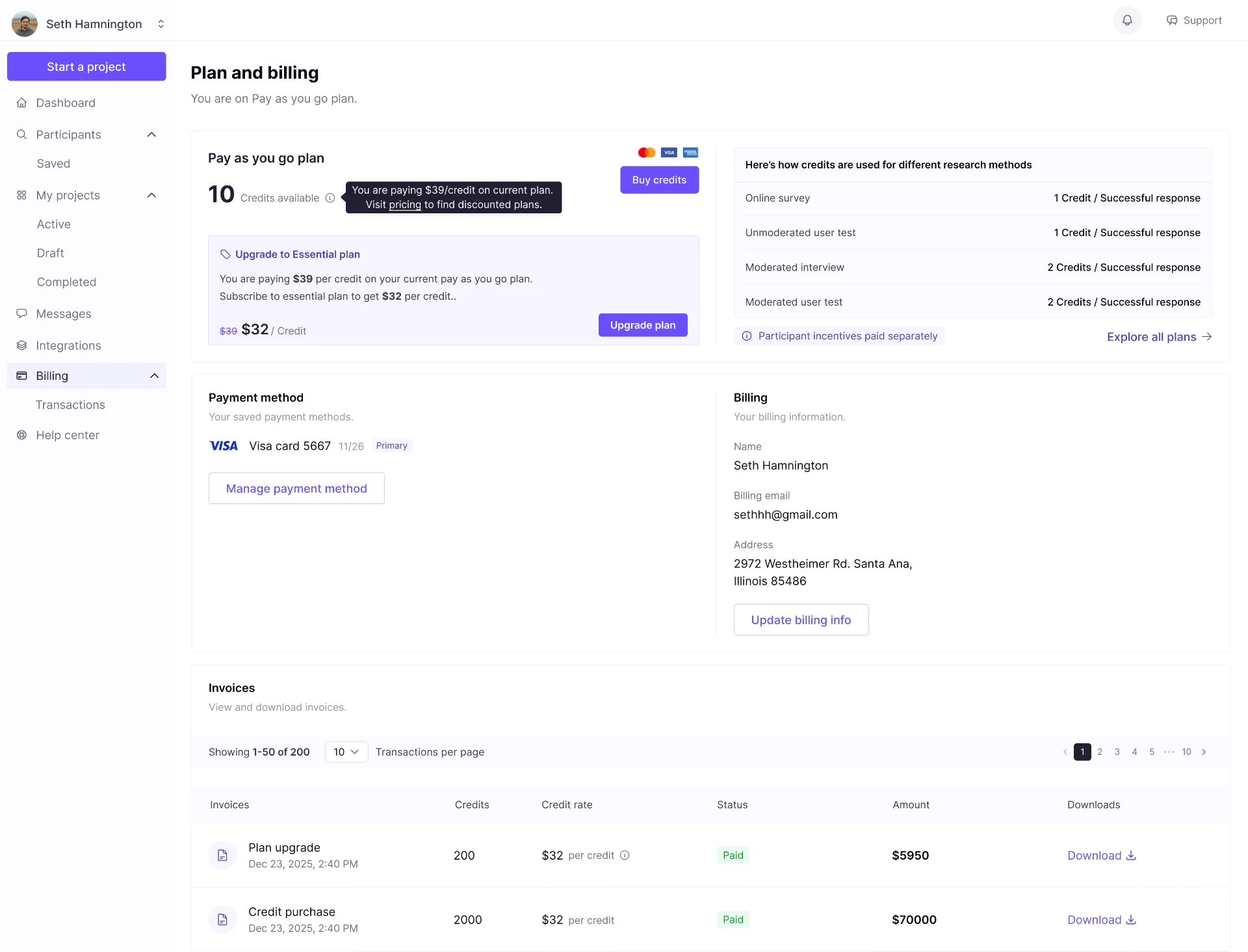
I placed the research-method credit table on both the billing overview and the plan-selection page. This allowed customers to check their available balance and estimate future credit needs while deciding whether to buy more capacity or change their plan.
For example, a team planning moderated interviews could immediately see that each successful response required two credits, while surveys and unmoderated user tests required one.
I also made participant incentives visibly separate from credits, preventing customers from assuming that credits covered every study cost.
Design decision 2: Separate buying credits from changing a plan
During flow design, I identified two related but distinct customer intentions:
“I need more credits for upcoming research.”
“I need a different pricing arrangement.”
Buying capacity is not always the same as changing a subscription plan. Combining these actions would have implied that every purchase required a commitment change.
For pay-as-you-go customers, the billing experience offered two distinct actions:
- Buy credits
- Explore annual plans
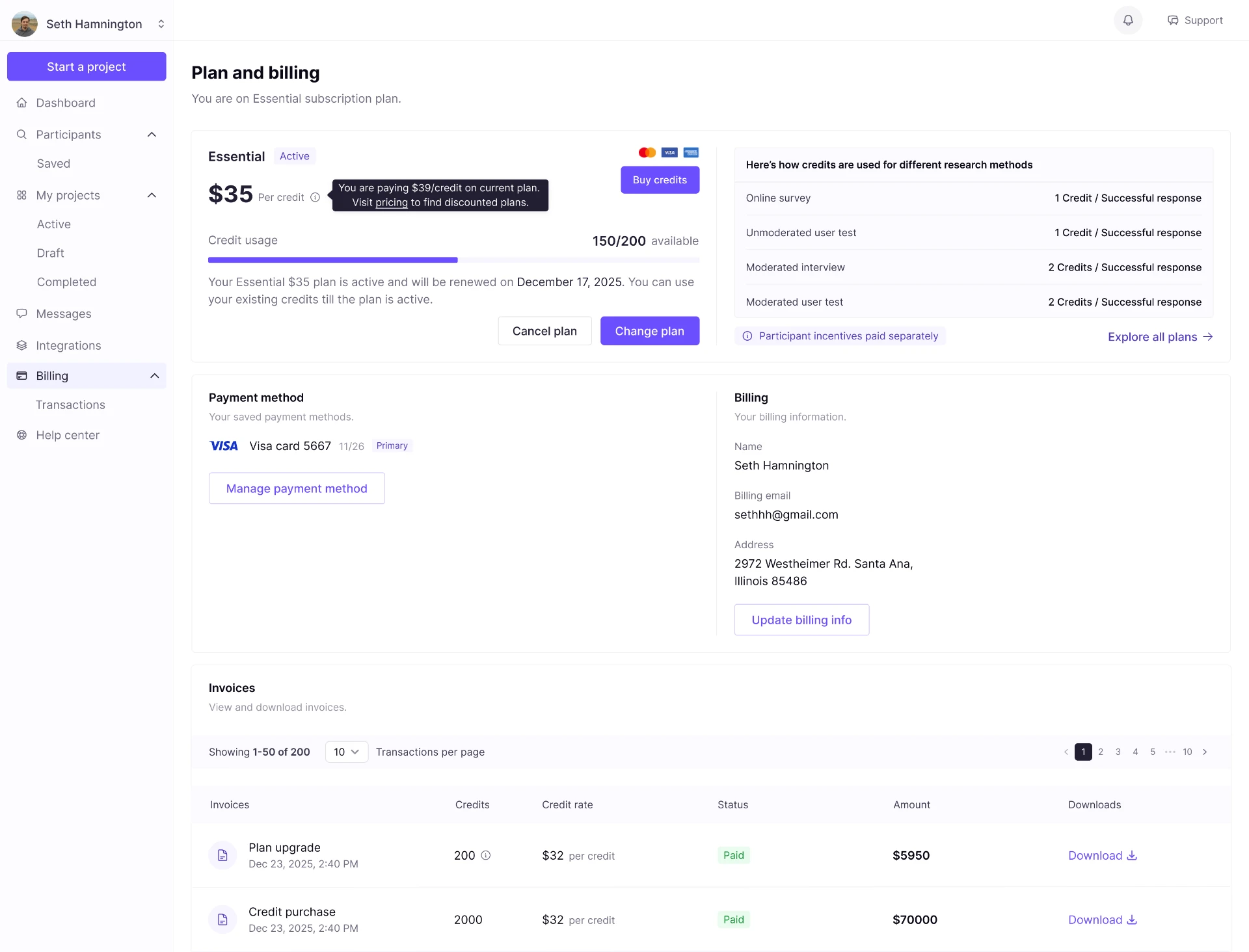
For subscription customers, it supported:
- Buying additional credits
- Changing to a higher or lower credit commitment
- Cancelling a plan
- Managing payment methods and billing information
By separating these paths, the design matched the customer’s actual intent rather than forcing every need through one upgrade flow.
Making pricing trade-offs visible
The pricing structure combined flexible purchasing with annual plans.
| Pricing option | Price per credit | Commitment |
|---|---|---|
| Pay as you go | USD 39 | No minimum purchase requirement |
| Essential - 100 credits | USD 35 | Annual commitment; minimum 100 credits |
| Essential - 200+ credits | USD 32 | Annual commitment; minimum 200 credits |
The annual options included the same core product features. The meaningful differences were credit quantity, unit price, and commitment level.
Feature comparison alone was therefore not enough. Customers needed to see the financial consequence of selecting more capacity and committing annually.
- 18% lower unit price
- USD 32 compared with USD 39 pay-as-you-go
- 8.6% lower unit price
- USD 32 compared with the USD 35 annual rate
Note: These figures compare unit price only. Total spending still depends on selected quantity and annual commitment.
Design decision 3: Connect quantity to its pricing consequence
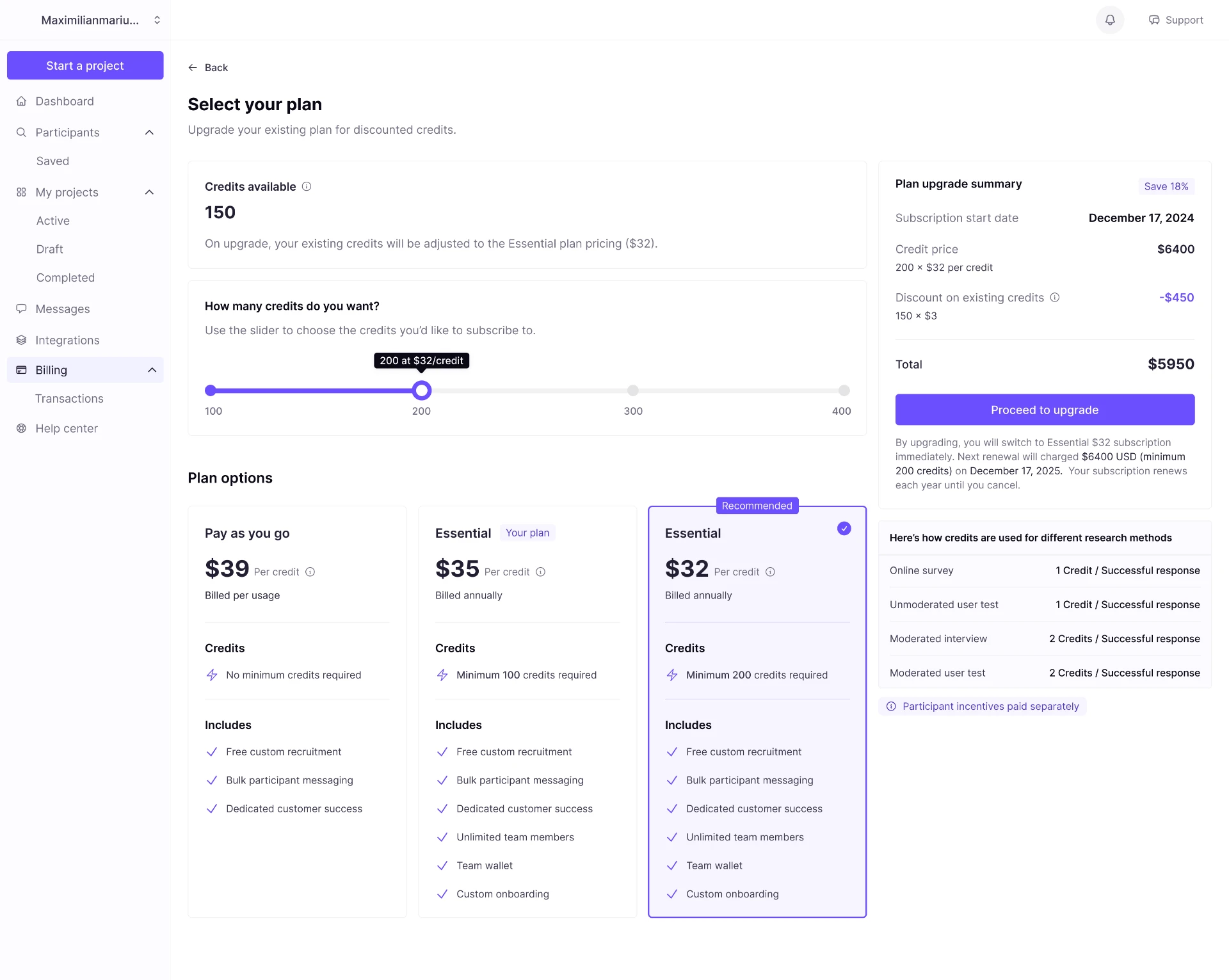
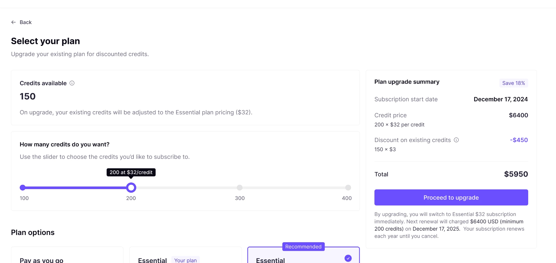
The plan-selection screen used a quantity selector with clear purchase levels. As customers adjusted the selected amount, the interface updated the credit quantity, unit price, and total annual cost together.
Example tooltip / slider label:
200 credits at USD 32 per credit
This allowed customers to evaluate the relationship between research capacity, cost per credit, and annual commitment in one place.
The selected plan card and summary panel reinforced the same information, reducing the risk that customers would choose a lower unit price without noticing the associated minimum commitment.
The most complex scenario: Explaining an existing-credit rate adjustment
The most complex part of the billing flow was the upgrade calculation.
A customer could already hold credits purchased at one rate and then move to an annual plan with a lower rate. The system applied an adjustment to account for the price difference on the customer’s existing credits.
The design challenge was to make this adjustment feel fair and understandable - rather than presenting customers with an unexplained total that differed from the plan price.
Upgrade scenario
The customer:
- Has 150 credits available
- Previously paid USD 35 per credit
- Upgrades to a 200-credit annual plan at USD 32 per credit
| Calculation | Amount |
|---|---|
| Selected annual subscription: 200 × USD 32 | USD 6,400 |
| Existing-credit rate adjustment: 150 × (USD 35 − USD 32) | −USD 450 |
| Amount due today | USD 5,950 |
Instead of hiding the adjustment in the final total, I designed it as a separate line item.
The summary showed:
- The number of existing credits affected
- The previous and new credit rates
- The resulting adjustment
- The total charged today
Design decision 4: Separate today’s charge from the recurring commitment
In the upgrade scenario, the customer paid USD 5,950 today, while the annual plan renewed at USD 6,400.
Those amounts differed because the existing-credit rate adjustment applied only to the upgrade transaction. It did not reduce the future renewal price.
To make this clear, I separated:
- Due today - the immediate charge after the existing-credit adjustment
- Renews annually - the recurring annual cost of the selected plan
- Subscription start date - when the new plan became active
- Next renewal date - when the recurring charge would apply
This was important because customers were making two decisions at once:
- Is the immediate upgrade cost acceptable?
- Is the ongoing annual commitment acceptable?
The adjustment lowers the first payment only. The annual renewal remains based on the selected plan’s full subscription cost.
Designing beyond checkout
Billing does not end when a customer confirms payment. Research teams also need to manage their account, update payment information, and reconcile previous transactions.
The redesigned billing area included:
- Saved payment methods
- Editable billing information
- Credit balance and plan overview
- Invoice history
- Transaction status
- Credits purchased
- Credit rate per transaction
- Context for plan upgrades and existing-credit adjustments
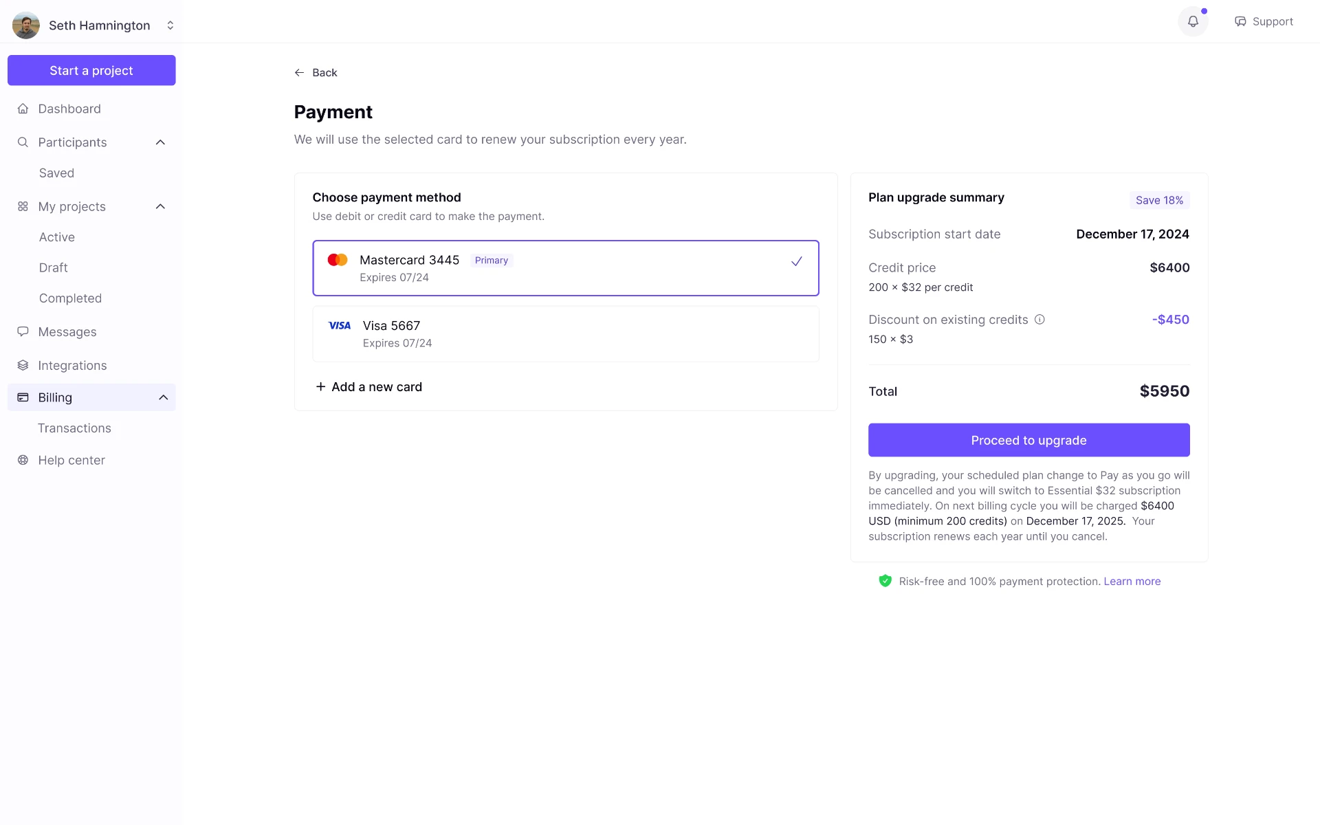
Customers needed to understand not only what they were buying, but also what they owned, what they had paid for, and what they would be charged next.
Designing for plan changes, not just upgrades
Customers also needed to reduce or end their commitment without losing access unexpectedly.
When a customer switched from Essential to pay-as-you-go, the modal made three things explicit:
- Auto-renewal would be cancelled
- The plan change would take effect at the end of the current billing cycle
- Existing plan access and credits would remain available until that date
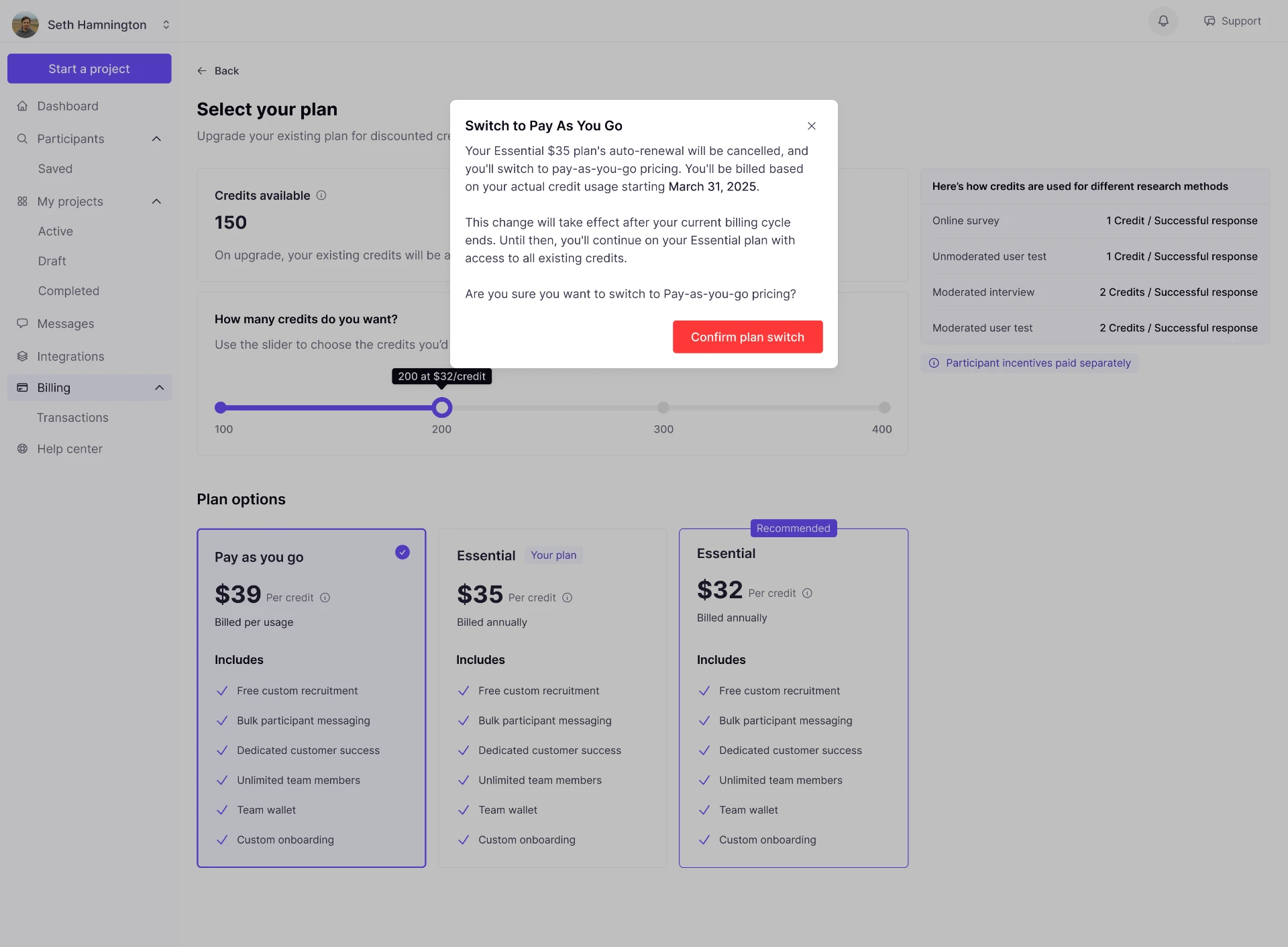
A plan change should not feel like an immediate loss of access. The modal explains what changes now, what remains available, and when the new pricing takes effect.
Key trade-offs
Transparency vs. cognitive load
Showing every pricing rule at once would overwhelm customers. Hiding too much would make charges feel arbitrary or untrustworthy.
I prioritised the information that directly affected a customer’s decision or payment:
- Selected credit quantity
- Unit price
- Minimum commitment
- Total annual subscription cost
- Existing-credit rate adjustment
- Amount due today
- Renewal amount and date
Supporting details were made available in context without competing with the primary decision.
Flexible purchasing vs. annual commitment
Pay-as-you-go offered flexibility, while annual plans offered lower unit prices in exchange for a higher commitment.
The design did not position one option as universally better. Instead, it made the trade-off explicit so customers could choose based on their expected research volume and budget.
Commercial accuracy vs. customer language
Billing rules originated in internal pricing logic, but customers should not need to understand internal terminology to make a purchase.
I translated commercial concepts into customer-facing language such as:
- Credits available
- Price per credit
- Amount due today
- Annual renewal
- Existing-credit rate adjustment
This helped keep the experience accurate without making it feel like an accounting interface.
Outcome
The redesigned billing experience shipped with:
- A shared-credit model across surveys, unmoderated tests, moderated interviews, and moderated user tests
- Billing overviews for pay-as-you-go and annual-plan customers
- Credit-use guidance within billing and plan-selection decisions
- Plan comparison and quantity selection
- Transparent existing-credit rate adjustments during upgrades
- Clear separation between immediate charges and recurring annual renewal
- Payment-method and billing-information management
- Invoice history with transaction-level detail
| Area | What changed |
|---|---|
| Billing model | Expanded from survey-specific payments to a shared-credit system across research methods |
| Customer decisions | Connected research-method requirements, credit quantity, price, and commitment in one flow |
| Upgrade transparency | Made existing-credit adjustments visible, traceable, and understandable |
| Account management | Added billing overview, payment methods, billing details, and invoice management |
| Commercial clarity | Clearly distinguished amount due today from future annual renewal |
Impact
| Metric | Impact |
|---|---|
| Checkout completion | Increased by 12% during staged rollout compared with the previous checkout flow |
| Billing disputes | Reduced by 34% over the following two quarters, based on Finance dispute logs |
| Product capability | Enabled one commercial model across multiple research methods rather than survey-only payments |
The redesign helped the platform evolve from a simple survey-payment experience into a scalable billing system for a broader research product.
More importantly, it gave customers clarity at the moment it mattered most: when deciding how much research capacity to purchase, whether to commit to an annual plan, and how to interpret an upgrade charge.