Role-based onboarding design for a two-sided research platform
A research platform served two distinct audiences: researchers, who needed to create and manage studies, and participants, who wanted to find paid research opportunities.
Previously, both audiences entered through one generic sign-up journey and arrived in the same product experience. Also, the onboarding flow required participants to wait for their LinkedIn profile to be imported, review the imported information, and complete missing fields before they could access the dashboard - creating unnecessary friction before they had experienced the platform’s value.
I redesigned the onboarding experience around user intent. The solution introduced role selection before sign-up, separate onboarding paths, a faster participant-verification flow, and role-specific dashboards.
- Role
- Product Designer
- YEAR
- 2025
- Scope
- Onboarding strategy, role-based information architecture, UX flows, UI design, participant-verification experience, and role-specific dashboards
- Platform
- Two-sided research marketplace connecting researchers with vetted participants for paid studies
Impact at a glance
- 32%
- increase in sign-up completion
- 75%
- faster time to opportunity discovery
- 28%
- increase in paid-study participation
The problem
The platform supported two connected, but fundamentally different tasks:
| Researchers | Participants |
|---|---|
| Create and manage research studies | Find and apply to paid studies |
| Recruit suitable participants | Complete screeners and participate in research |
| Manage projects, messages, and subscriptions | Track invitations, participation, and incentives |
| Search and save participant profiles | Build and maintain a credible participant profile |
Despite these differences, both groups previously used:
- One generic sign-up flow
- One LinkedIn import and profile-completion process
- One shared dashboard containing features for both roles
This created two main problems:
Users had to interpret irrelevant product functionality before reaching their goal.
Researchers encountered participant-oriented actions, while participants encountered research-management tools. Both had access to the same view of the dashboard. It wasn't tailored to their needs.
Sign-up required too much effort before users could see product value.
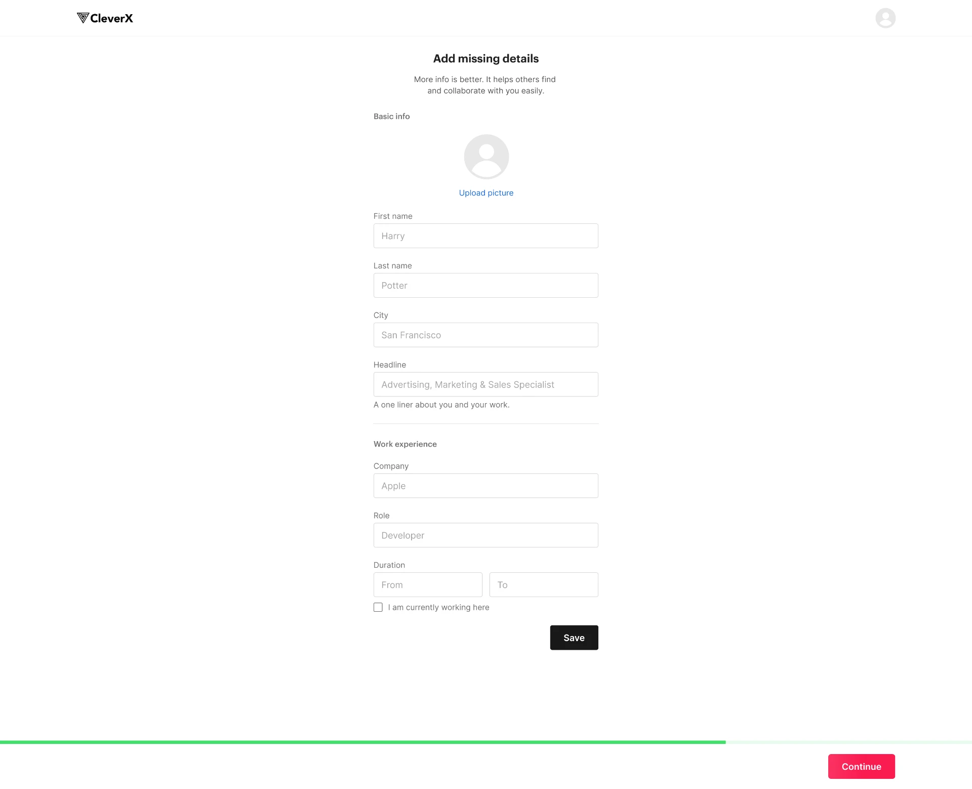
In the previous participant journey, users imported their LinkedIn profile, reviewed the imported information, edited sections, and completed missing details - such as work experience, location, and biography - before they could access the dashboard or explore available paid opportunities.
For participants especially, this meant they could abandon the flow before seeing available paid opportunities. For researchers, participant-profile requirements added steps that were not necessary to begin using research tools.
Previous flow:
- Sign up
- Email verification
- Add LinkedIn profile URL
- Import and review LinkedIn information
- Complete missing profile details
- Access dashboard and paid-study opportunities
The issue was not simply form length. Before users could view paid opportunities, the platform asked them to import, review, edit, and complete profile information. This increased cognitive load at the highest-risk point in the journey: before users had seen enough value to justify the effort.
Defining the design challenge
The platform needed to preserve participant-quality controls while creating a faster, clearer path to value for both audiences.
How might we help researchers begin research work and help participants discover paid opportunities sooner - without weakening participant verification or preventing users from accessing both sides of the marketplace?
The redesign needed to:
- Separate researcher and participant journeys early.
- Reduce unnecessary sign-up friction.
- Retain LinkedIn-based profile collection for participants, where it supported marketplace trust.
- Move profile review and completion out of sign-up, while requiring a completed participant profile only when a user applies to participate in a paid study.
- Allow participants to browse opportunities and view study details before completing their profile.
- Give each audience a dashboard designed around its primary tasks.
- Allow users to switch roles without bypassing eligibility or verification requirements.
- Enable the team to measure onboarding and activation separately by role.
Learning from comparable products
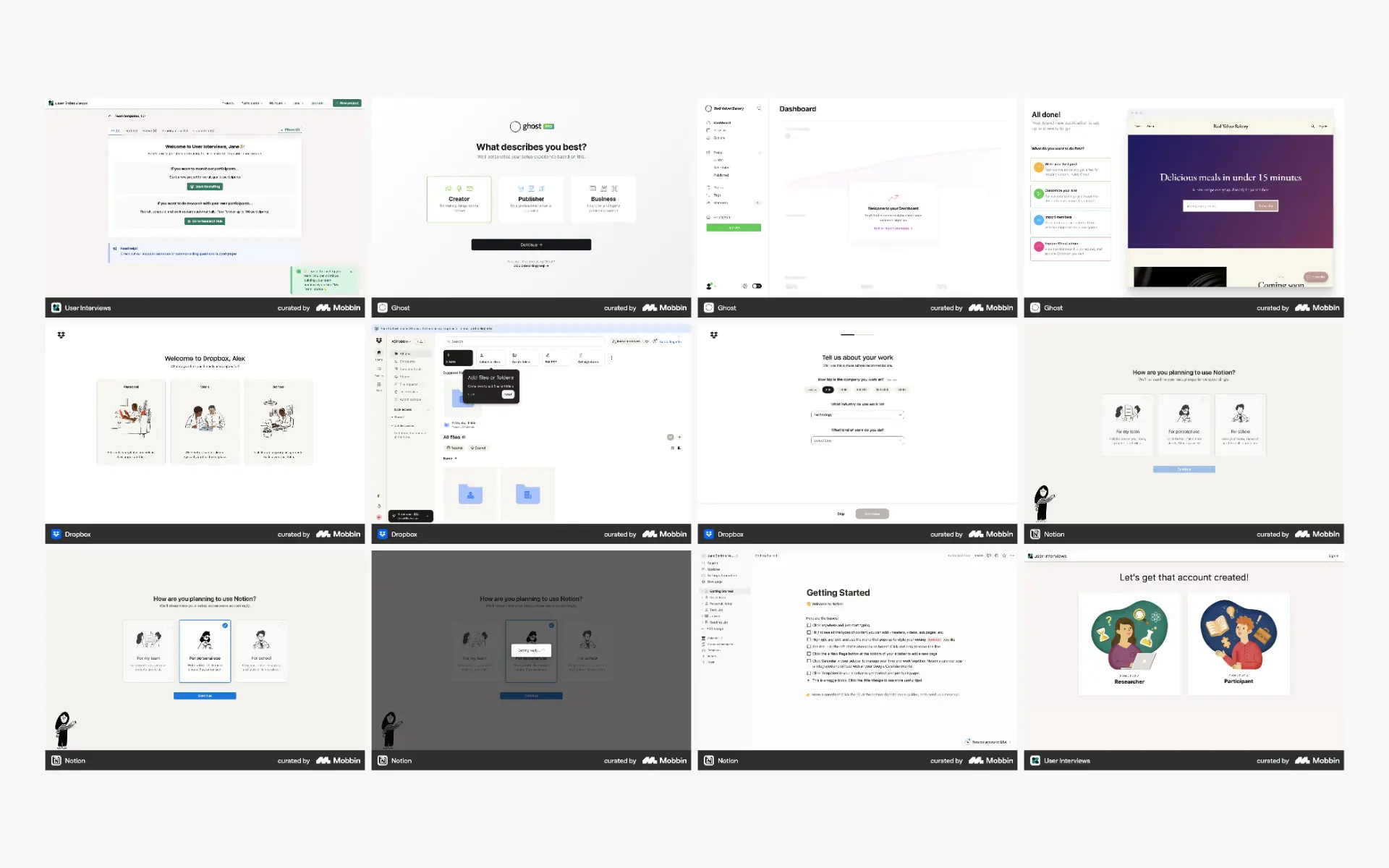
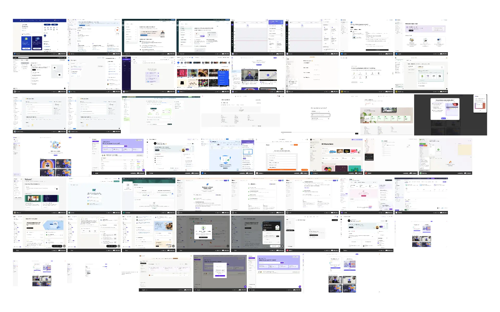
Before deciding on role selection, I reviewed how comparable products establish user intent during onboarding.
I examined onboarding patterns from products including:
- Dropbox
- Notion
- User Interviews
The most relevant reference was User Interviews, because it also operates as a two-sided research marketplace with distinct researcher and participant needs.
The analysis showed that role or intent selection can be valuable when:
- Different audiences have different first-time goals.
- The product contains role-specific workflows and terminology.
- One account can potentially access multiple parts of the product.
- The business needs clearer funnel measurement by audience.
- The experience needs to balance marketplace access with participant quality.
This did not mean copying a competitor’s flow. It helped validate the strategic principle: establish user intent early, then tailor the first-use experience around it.
| Pattern observed | Relevance to this platform | Design decision |
|---|---|---|
| Intent is captured early | Researchers and participants have different jobs-to-be-done | Add role selection before sign-up |
| Language is based on user goals | Some users may not identify with internal role labels | Use goal-based descriptions, not only “Researcher” and “Participant” |
| Different audiences receive tailored activation paths | Shared onboarding caused irrelevant steps and unclear next actions | Create separate researcher and participant onboarding |
| Marketplace platforms protect participant quality | Participant credibility affects researcher trust and study quality | Keep participant verification, but reduce unnecessary friction |
Insight: profile completion was necessary for applying, not for exploring
LinkedIn verification played an important role in maintaining a trustworthy participant pool.
A verified professional profile gave the platform an additional quality signal, helping reduce the likelihood of fraudulent or low-quality participant responses. This was particularly important because researchers needed confidence that they were recruiting credible, relevant people.
However, the previous experience treated profile completeness as a prerequisite for product access.
Users were asked to:
- Import their LinkedIn profile.
- Review imported information.
- Edit profile sections.
- Complete missing information such as location, work history, and “About” details.
- Only then access the dashboard.
The core insight was:
Participants needed a complete profile before applying to a paid study, but not before signing up, entering the dashboard, browsing opportunities, or viewing study details.
This distinction made it possible to preserve participant-quality requirements at the point where they mattered most - when someone applied to join a study - without requiring every new participant to complete their profile before they could experience the marketplace.
Participants could submit their LinkedIn profile URL during sign-up, enter the dashboard immediately, and browse available opportunities while profile information imported in the background. If they chose to apply for a study and their profile was incomplete, the product could then prompt them to review imported information and complete the remaining required fields.
The solution
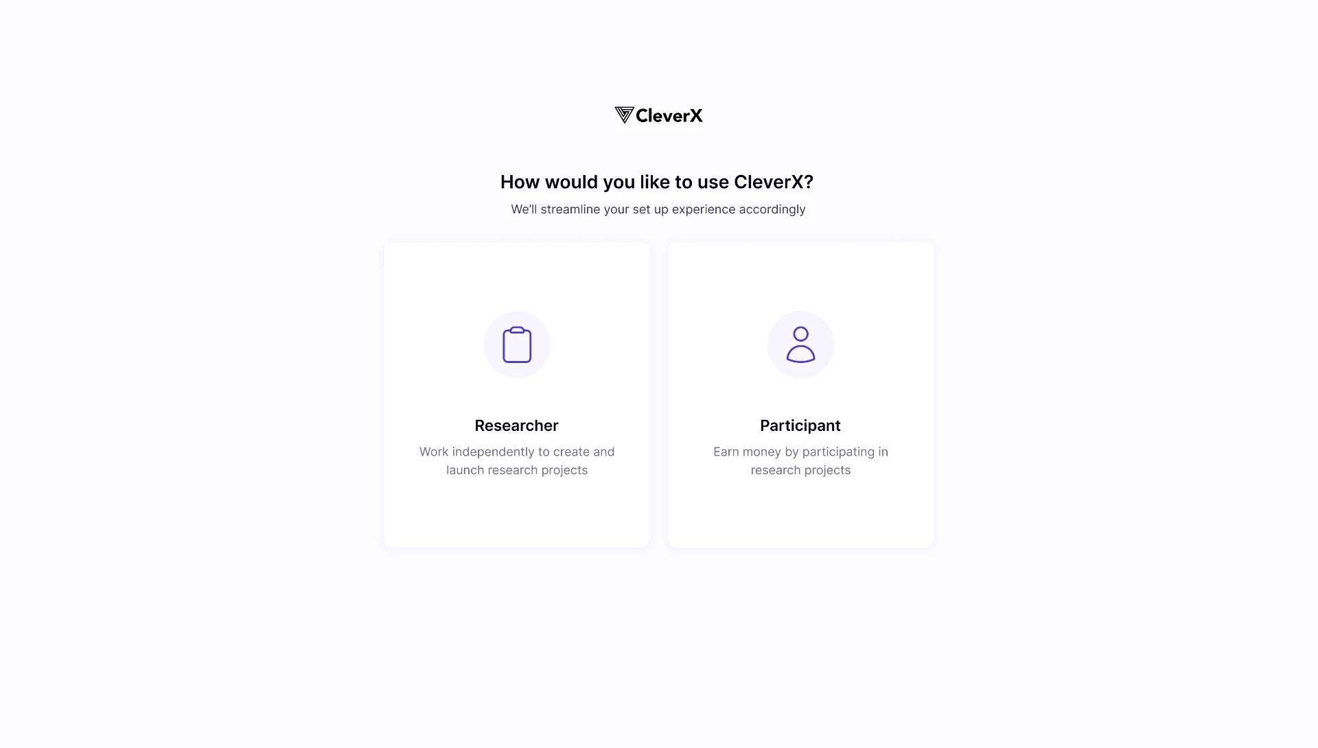
1. Establish intent before sign-up
The redesign for onboarding began with a simple decision:
- Conduct research
- Participate in paid studies
Rather than treating a user’s role as a permanent identity, the choice established the user’s initial intent and determined the most relevant onboarding path and dashboard.
I used goal-based language because it is more immediately understandable than relying only on product-specific labels such as “researcher” or “participant.”
Why role selection came before sign-up
Placing this decision before account creation allowed the product to:
- Set expectations about what each path offered.
- Use relevant language from the first screen.
- Give researchers a direct route to research work.
- Explain participant verification in the appropriate context.
- View researcher and participant journeys and note all points that caused any friction independently.
- Avoid exposing both groups to irrelevant product features immediately after sign-up.
2. Create a direct researcher path
Researchers did not need participant verification to begin using research tools.
Their onboarding flow became:
- Choose “Conduct research”
- Sign up
- Email verification
- Researcher dashboard
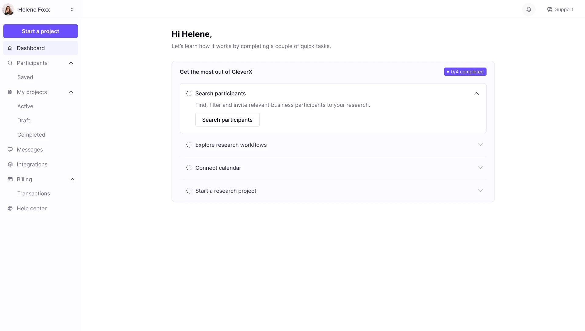
The researcher dashboard prioritized the actions needed to begin or continue research work:
- Create a study
- View and manage projects
- Search the participant pool
- Save participant lists
- Access messages
- Manage billing and integrations
The primary design goal was to make the next meaningful action obvious: start a study, continue an existing project, or find participants.
3. Move profile completion to the moment a participant applies
Participants followed a lighter sign-up path because profile completion was no longer required before they could access the marketplace.
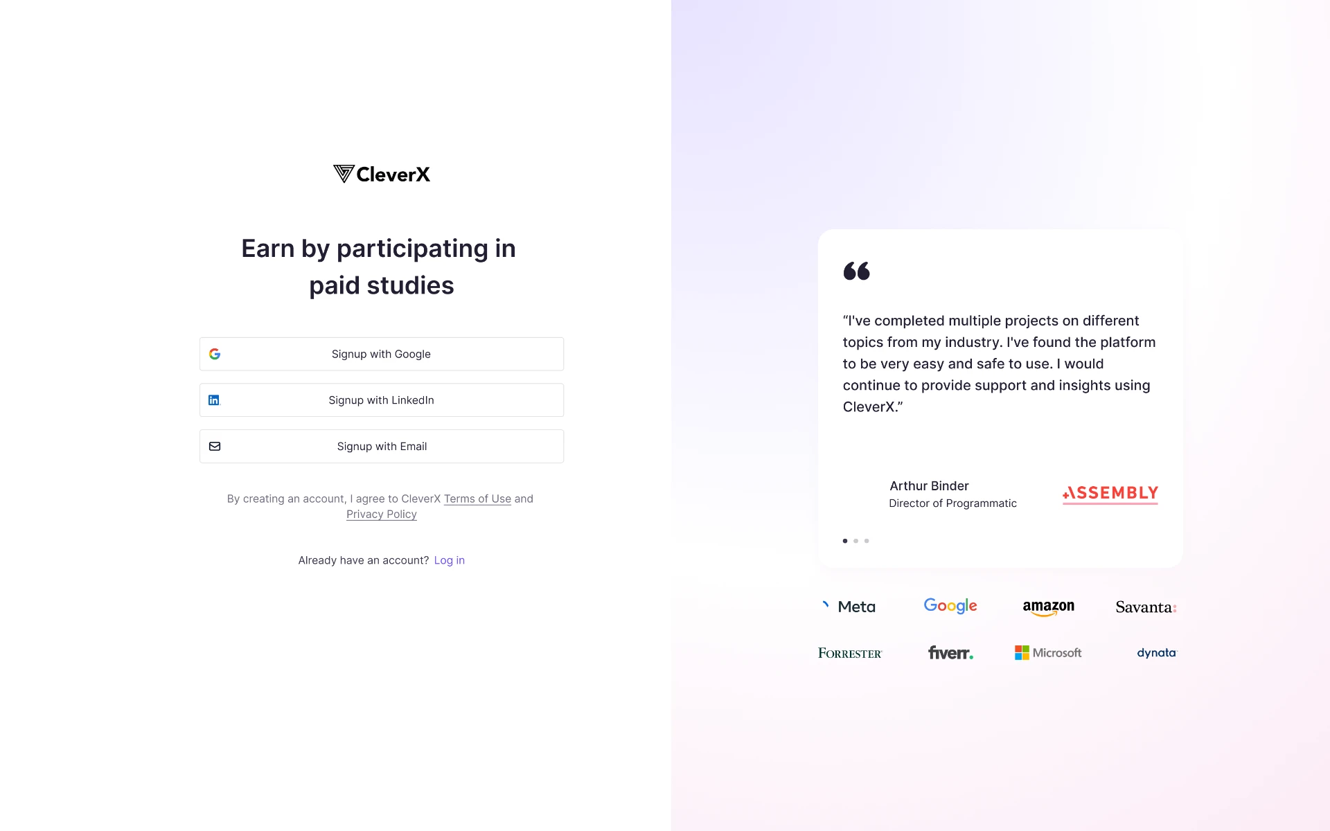
- Choose “Participate in paid studies”
- Sign up
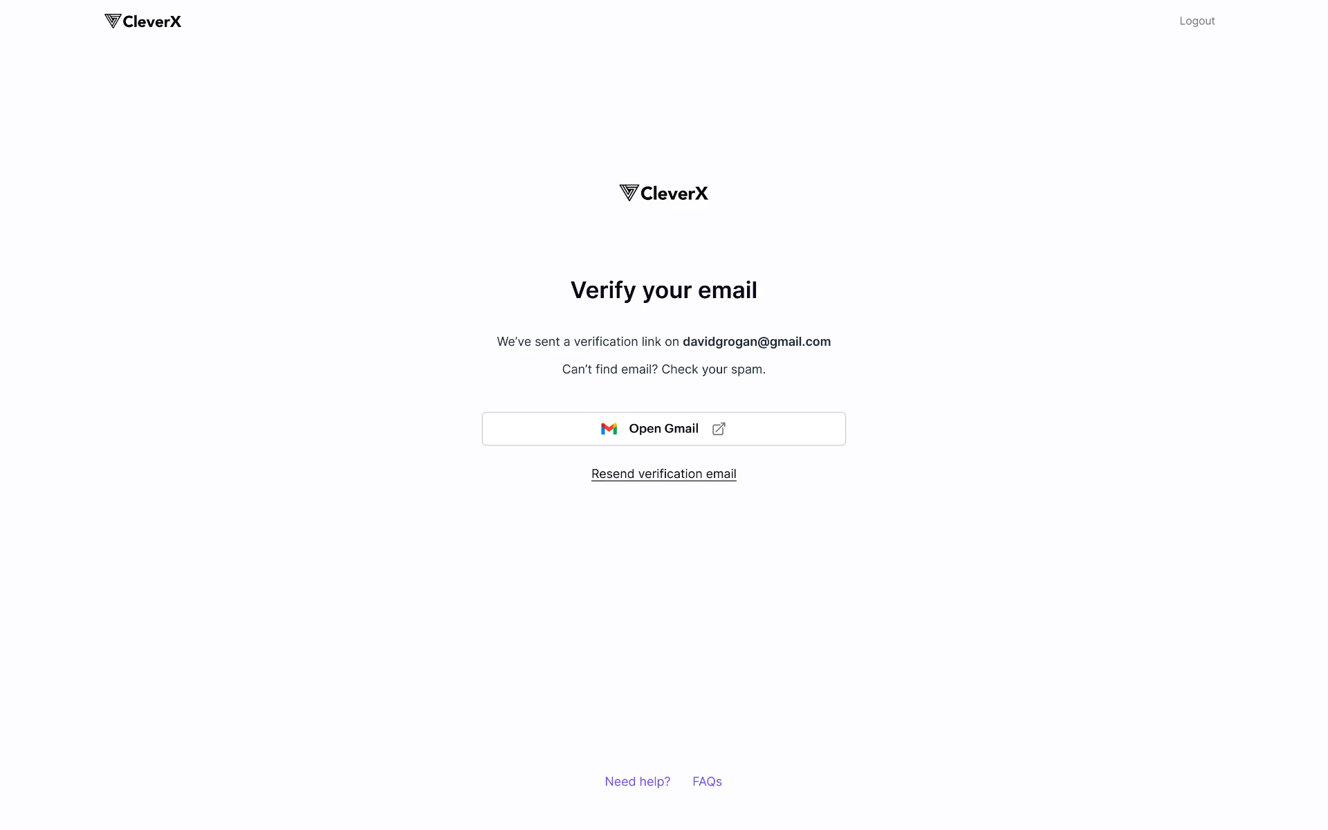
- Email verification
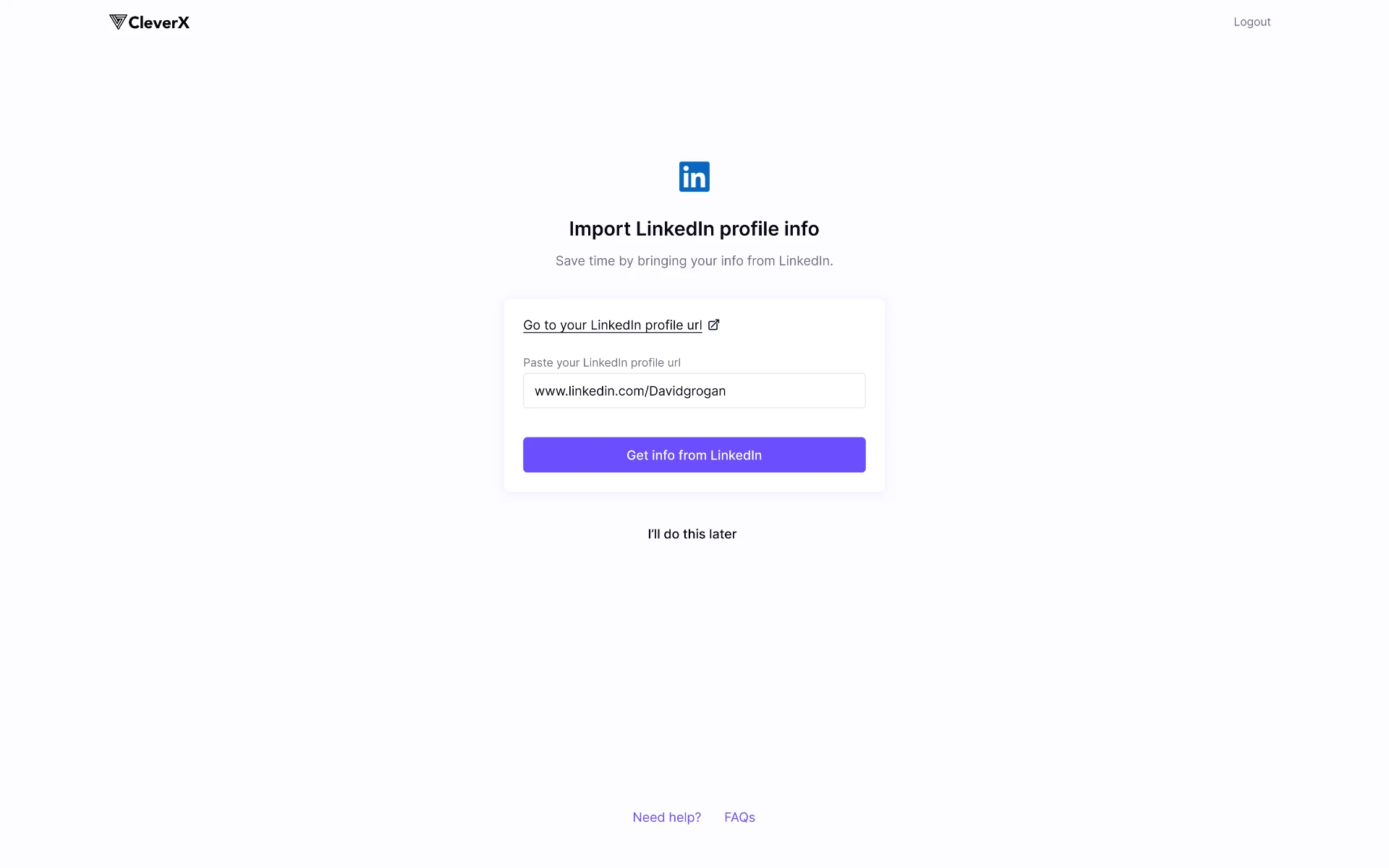
- Add LinkedIn profile URL
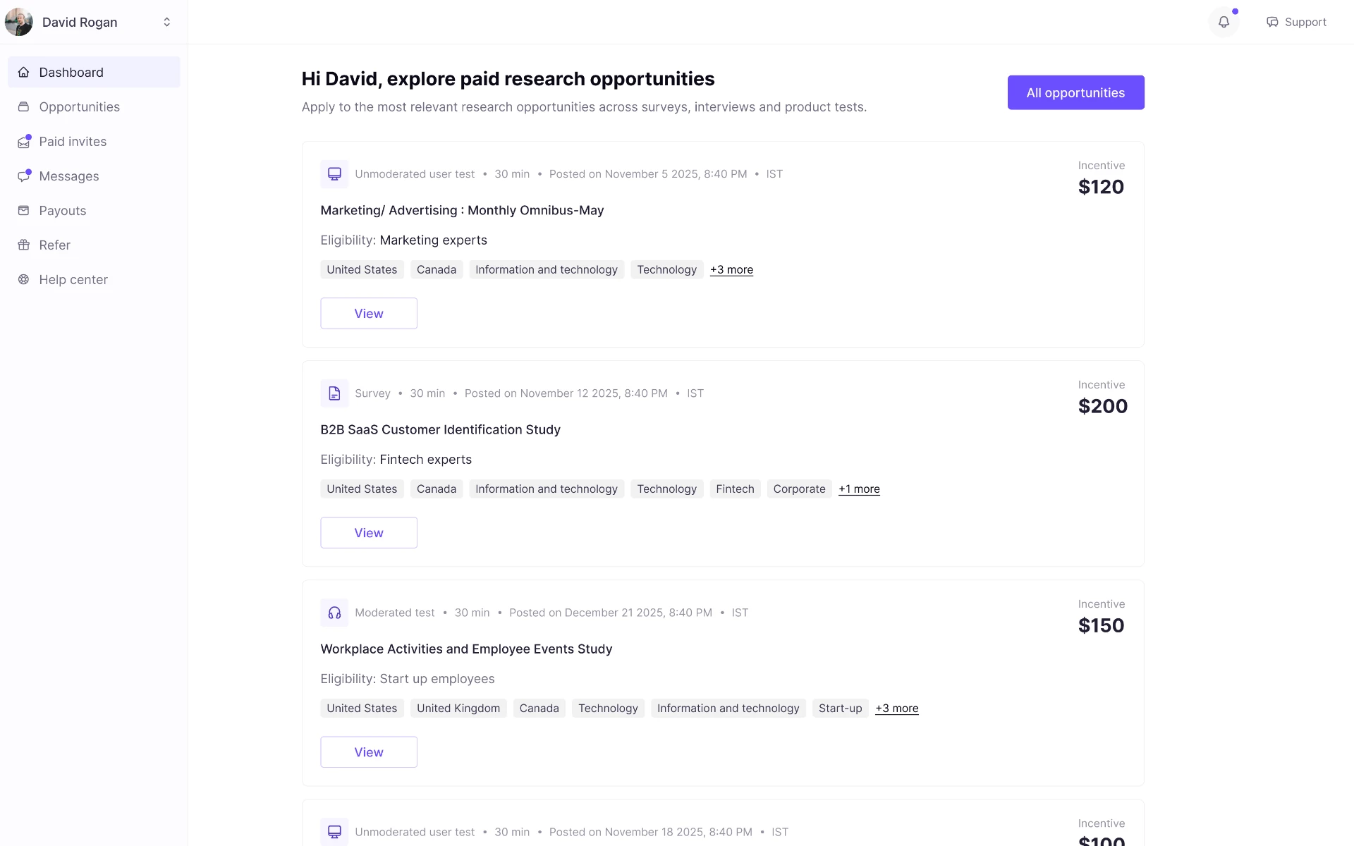
- Participant dashboard
After a participant submitted their LinkedIn profile URL, the platform began importing profile information in the background. There was no loading state, profile-review step, or missing-information form during sign-up.
Participants could immediately browse opportunities and view study details. A completed profile became necessary only when they chose to apply to participate in a study.
Instead of requiring users to wait for a profile import, review every field, and complete missing information before entering the product, the new flow:
- Asked participants to submit their LinkedIn profile URL during sign-up.
- Started importing LinkedIn profile information in the background.
- Sent participants directly to the dashboard after URL submission.
- Allowed participants to browse opportunities and view study details without a completed profile.
- Required profile completion only when a participant attempted to apply for a paid study.
- Directed participants to review imported information and complete any required fields at that point, or later through Settings → Profile.
This changed the experience from:
“Complete your profile before you can see anything.”
to:
“Add your LinkedIn URL, explore paid opportunities immediately, and complete your profile only when you are ready to apply.”
Why this mattered
Participants previously had to complete administrative profile tasks before they could see whether relevant paid studies were available. This created friction before users had experienced the core value of the marketplace.
By allowing participants to reach the dashboard immediately, browse opportunities, and view study details before completing their profile, the experience made value visible much sooner. Profile completion was requested at a more relevant moment: when a participant chose to apply for a specific study.
This preserved the quality information researchers needed from applicants, while avoiding unnecessary work for participants who were still exploring the marketplace.
4. Design a participant dashboard around opportunity, status, and earnings
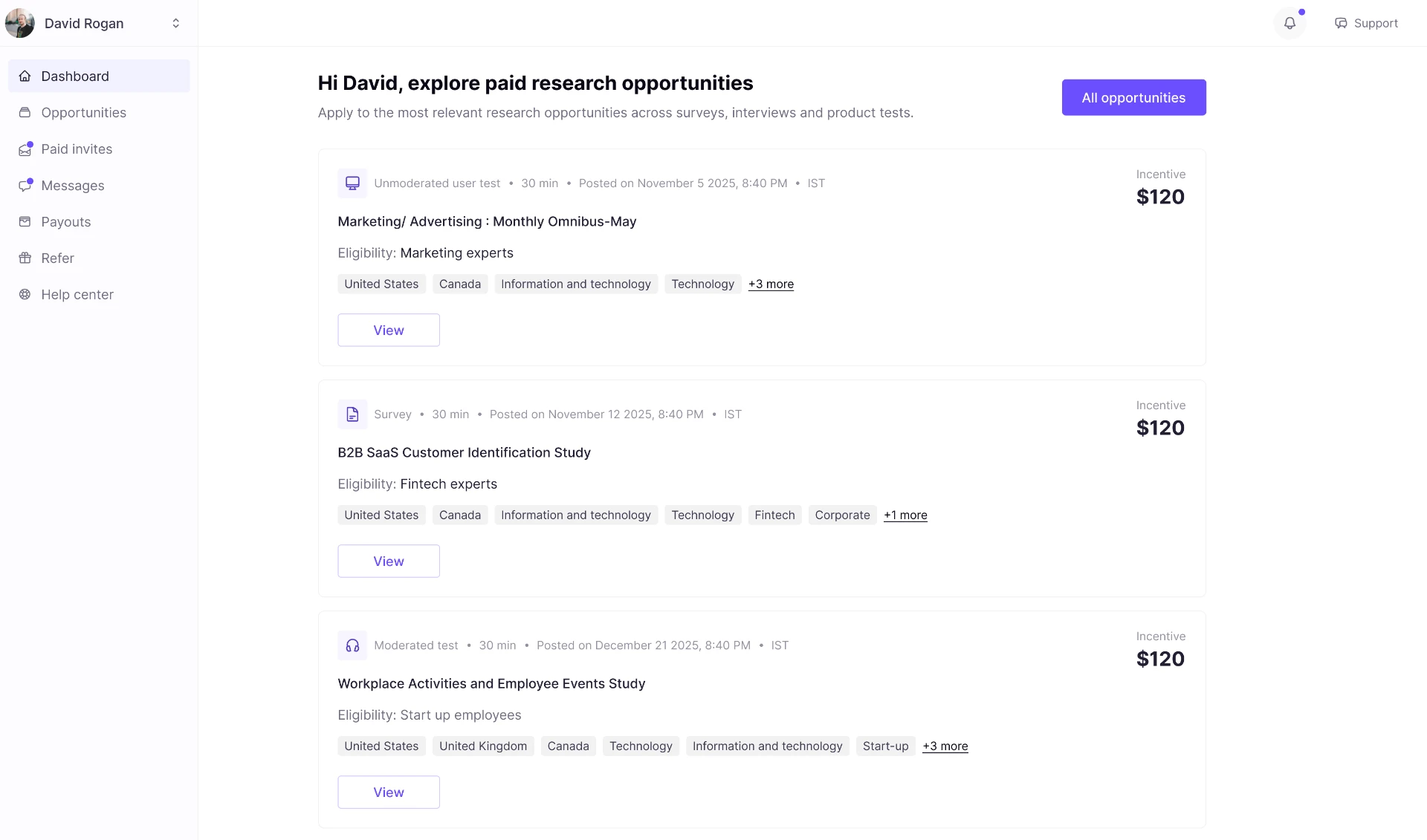
After signing up and submitting their LinkedIn profile URL, participants entered a dashboard built around three questions:
- What paid opportunities are available to me?
- What is happening with studies I have already applied to or joined?
- What have I earned, and how can I access it?
Participants could browse all available opportunities and view their details without a completed profile. If they selected Apply, the platform checked whether the participant profile was complete and prompted for any required information before the application could be submitted.
The participant dashboard prioritized:
- Available opportunities
- Direct invitations
- Screener status
- Participation history
- Earnings and payout access
- Messages
5. Reorganize the product around each audience’s primary work
Separate onboarding would not have solved the problem on its own. The signed-in experience also needed to respond to the user’s initial intent.
Researcher dashboard
The researcher experience prioritized:
- Creating studies
- Managing active and completed projects
- Finding suitable participants
- Reusing saved participant lists
- Communicating with participants
- Managing subscription and integrations
Participant dashboard
The participant experience prioritized:
- Discovering paid studies
- Managing invitations and screeners
- Tracking participation history
- Understanding earnings and payouts
- Browsing opportunities and viewing study details before profile completion
- Completing required profile information when applying to a study
The solution was not to remove features. It was to organize the same ecosystem around the task the user came to complete.
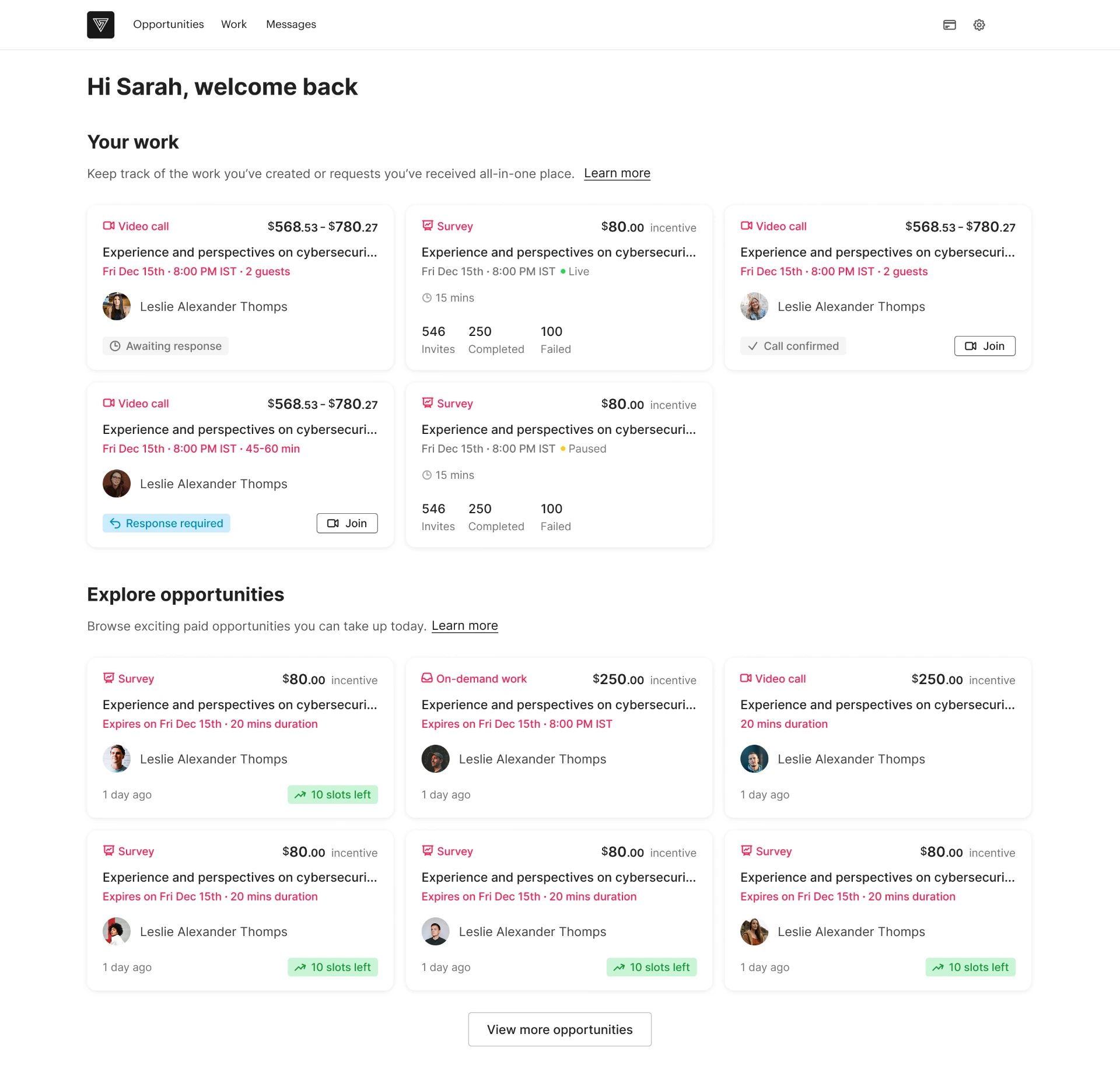
Before
Shared dashboard
- Create/manage studies
- Search participants
- Paid opportunities
- Invitations / screeners
- Earnings
- Messages
- Billing / integrations
After
Researcher dashboard
- Create study
- Projects
- Find participants
- Saved lists
- Messages
- Billing / integrations
Participant dashboard
- Available studies
- Invitations / screeners
- Participation history
- Earnings / payouts
- Messages
- Browse opportunities and view details
- Complete profile when applying, if required
Profile import continues in the background. Participants are prompted to complete missing required fields only when they apply to a paid study.
Both dashboards Switch role
Participant actions Verification required where applicable
6. Preserve flexibility through role switching
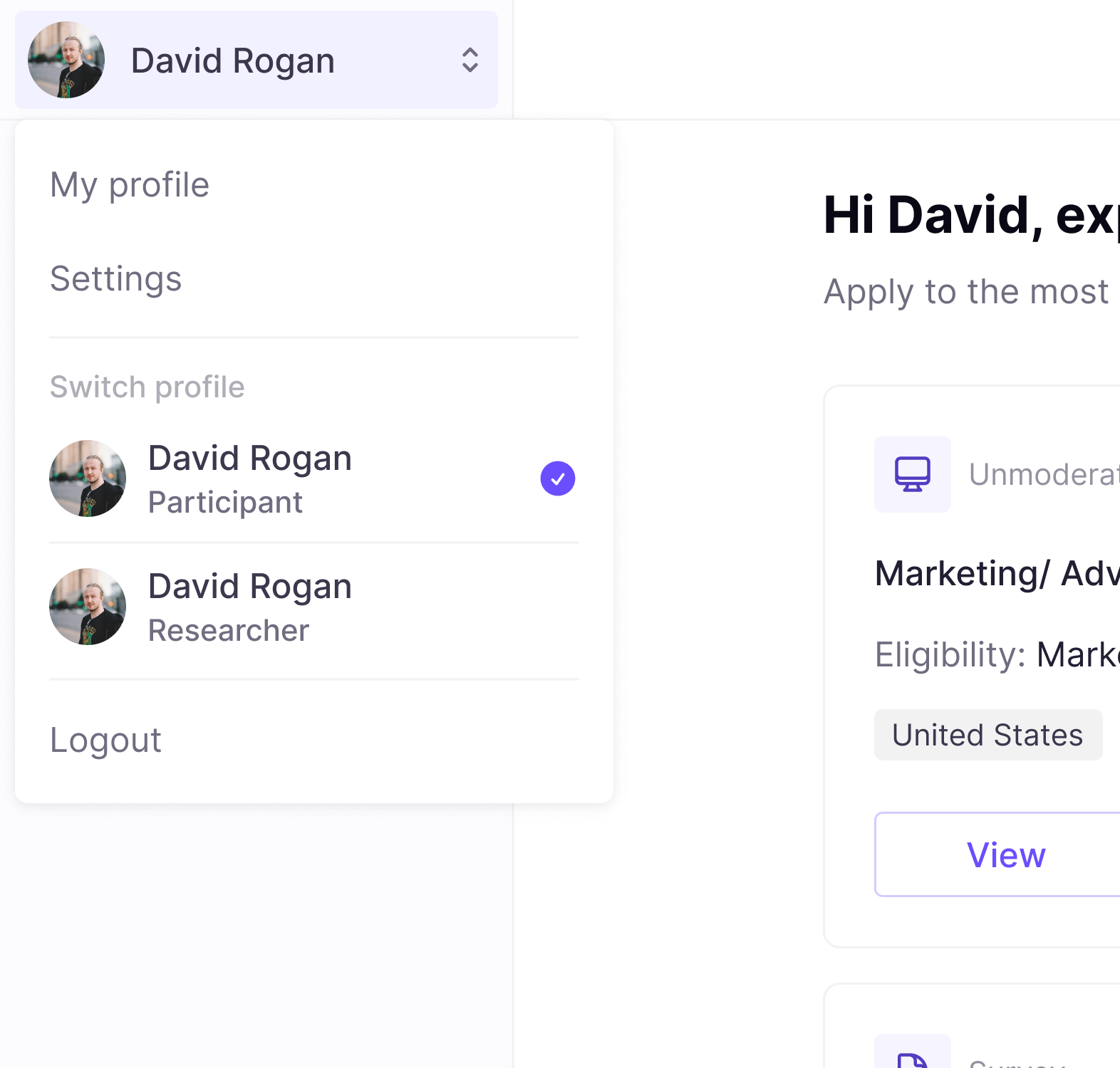
Users could have more than one relationship with the platform. A researcher might also want to participate in studies, while a participant might later need to conduct research.
I designed role switching so users could move between researcher and participant contexts without returning to a mixed dashboard.
However, switching views did not bypass requirements:
- A researcher switching to participant mode could access the participant dashboard and browse opportunities after providing a LinkedIn profile URL. If they chose to apply to a paid study, they needed to complete any missing required profile information before submitting the application.
- A participant switching to researcher mode could access the appropriate researcher onboarding or workspace.
This preserved flexibility without compromising the marketplace’s quality and trust model.
Key trade-offs
More choice at the start vs. less confusion later
Role selection introduced one additional step before sign-up. However, it reduced the ongoing cognitive load of asking every user to interpret a shared product experience.
The decision was made flexible through:
- Clear, goal-based descriptions
- Role switching after sign-up
- No permanent restriction based on the initial path
Application-time profile completion vs. participant quality
A complete participant profile was important for researchers evaluating applicants and for maintaining a credible participant pool. However, requiring profile completion at sign-up asked users to do work before they knew whether any relevant opportunities existed.
The design moved that requirement to the point of application:
- Participants could submit a LinkedIn URL and enter the dashboard immediately.
- LinkedIn profile information imported in the background.
- Participants could browse opportunities and view study details without a completed profile.
- When a participant selected Apply, the product checked for required profile information.
- If details were missing, the participant completed their profile before submitting the application.
This protected study quality at the decision point that mattered - joining a study - while keeping early exploration lightweight.
Focused dashboards vs. cross-role feature discoverability
Role-specific dashboards reduced exposure to irrelevant features. The trade-off was that the other side of the marketplace became less visible by default.
Role switching preserved access without forcing both workflows into the same interface.
Outcome
The redesign shipped with:
- Role selection before sign-up
- Separate researcher and participant onboarding paths
- LinkedIn profile URL collection with background profile import for participants
- Immediate participant-dashboard access after sign-up
- Opportunity browsing and study-detail viewing without profile completion
- Profile-completion prompts only when a participant applies to a paid study
- A Profile area in Settings for reviewing imported information and completing details proactively
- A researcher dashboard focused on study creation, projects, and participant discovery
- A participant dashboard focused on opportunities, participation status, and earnings
- Role switching that retained verification requirements for gated participant actions
- Separate funnel measurement for researcher and participant journeys
Impact
The redesigned onboarding reduced the effort required to reach value while preserving participant-verification standards.
| Metric | Impact |
|---|---|
| Blocking profile-completion effort | Removed profile import, review, and missing-field tasks from participant sign-up. Participants could access the dashboard, browse opportunities, and view study details immediately; profile completion was required only when they applied to participate in a study. |
| Time to access paid studies | Reduced the time from sign-up to opportunity discovery from 12 minutes to 3 minutes (75%) by replacing a blocking profile-review flow with LinkedIn URL submission, background import, and direct dashboard access. |
| Sign-up completion | Increased overall participant sign-up completion by 32%, as users encountered less friction before seeing the value of available paid studies. |
| Participant activation | Increased the share of new participants who reached, browsed, and viewed paid-study opportunities after signing up by 48%, because profile-completion requirements no longer blocked exploration. |
| Paid-study participation | Increased participation in paid studies by 28%, driven by more participants successfully reaching the marketplace and discovering relevant opportunities. |
By allowing participants to explore paid opportunities before completing their profile - and requesting missing information only when they applied - the redesign reduced sign-up friction, accelerated time to value, and preserved the quality signals researchers needed from study applicants.
What I learned
Onboarding should respond to intent, not just create an account
Capturing a user’s goal before sign-up only works when the product continues to reflect that goal after account creation. The onboarding flow and first signed-in experience should be treated as one connected journey.
Marketplace trust should be designed as a user experience
Verification is not merely an operational rule. It affects motivation, privacy expectations, perceived effort, and conversion. The challenge was not whether to verify participants, but how to make the process proportionate, transparent, and timed around user value.
Profile completion should be required at the right moment
A complete profile was valuable when participants applied to join a study, because researchers needed sufficient information to assess fit and trust the participant pool. But profile completion was not necessary for signing up, browsing opportunities, or deciding whether the marketplace was relevant.
Moving profile completion to the application moment aligned the requirement with user intent: participants invested effort only after identifying an opportunity they wanted to pursue.
Information architecture can reduce complexity without reducing capability
The platform did not need fewer features. It needed a clearer structure that prioritized the work each audience came to do.